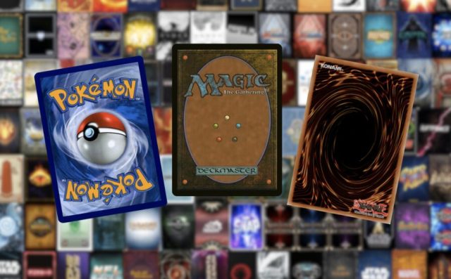
The Swirl. The Ball. The Brown on Brown.
If you have even a passing interest in Trading Card Games (TCGs), you are no doubt familiar with the three patron saints of card backs. Yu-Gi-Oh’s enticing cinnamon swirl; Pokémon’s cloudy, anatomically-incorrect Pokéball; Magic: The Gathering’s love letter to the color brown. You’ve probably seen these backs everywhere, in junk drawers, under couch cushions, inside four different cardboard boxes labeled DO NOT THROW AWAY. They are the inescapable hallmarks of our trade. You have probably stared a cumulative untold number of hours at The Swirl, The Ball, or The Brown on Brown. You have spent riches beyond your means, started wars, and dueled in their names. For all intents and purposes, they are your Gods. With that in mind: Welcome, dear reader, to our Pantheon.
Today, I’ll be ranking the card backs of every TCG, CCG, LCG, XCG, and plain old CG I could find, because actually playing and evaluating them all on merit would require hundreds if not thousands of hours of my time as well as enough money to earn a screenwriting degree at Sarah Lawrence College. If your TCG isn’t on this list, consider if any of the following are true: 1) Your game has more than two different card backs for different cards or decks, and so is not worth my time. 2) Your game has cards but is not a “card game” per se, and so is not worth my time. 3) Your game is so cool and niche I could not find it, and you should be rewarded with a special prize, to be determined by the comments section of this article. So please, do read on, and collect your reward.
#162: Vampire: The Eternal Struggle
If The Swirl, The Ball, and The Brown on Brown are our card back Gods, whatever’s happening on the back of Vampire: The Eternal Struggle’s cards igems Lucifer. But that’s a poor metaphor, considering Lucifer was once an angel and there’s no such redeeming quality here. These are the worst card backs I’ve ever set eyes on. The weird realistic gritty texture, the off-center symbol, the vertical text— I’ll say it again and again in this list: you can design a card back to be viewed horizontally, but no self-respecting person will play it that way. And that’s to say nothing of the colors. Granted, the green-blue isn’t half bad. I’d even say it looks amazing compared to the sulfur yellow of its companion, a color so noxious they named a chemical after it.
Perhaps the funniest detail is the little “Deckmaster” scroll on the left, which some will recognize from Magic: The Gathering cards. That’s because Vampire: The Eternal Struggle was first published by Wizards of the Coast, who planned on releasing a series of TCGs (including Magic and Vampire) under the brand “Deckmaster”. Of course, that plan fell apart as soon as Magic became the fattest cash cow to ever be milked.
#161: ChaOS
I can’t speak to ChaOS as a game, but I can speak to this sterile, lifeless card back. This looks like something your algebra teacher has on their shelf of math games. I see this and I 100% expect there to be multiplication tables on the other side. What am I supposed to do, summon my 8×9 in attack mode and swing for game? That’s a trick question obviously, card’s been banned since Integer Format.
#160: Young Jedi Collectible Card Game
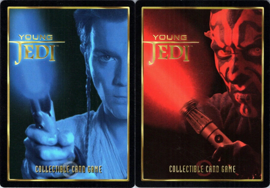
The first of six different Star Wars TCGs on this list, Young Jedi Collectible Card Game is easily the worst when it comes to backs. The black border with gold outline looks quite nice on its own; throw up a gold Star Wars logo on a minimalist space background and you could’ve been set. Instead, all that real estate is being leased to two giant floating heads that look like the stern faces of your parents asking how cardboard can be worth $20.
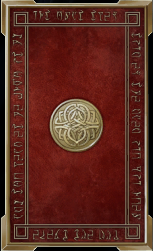
#159: Master of Wills
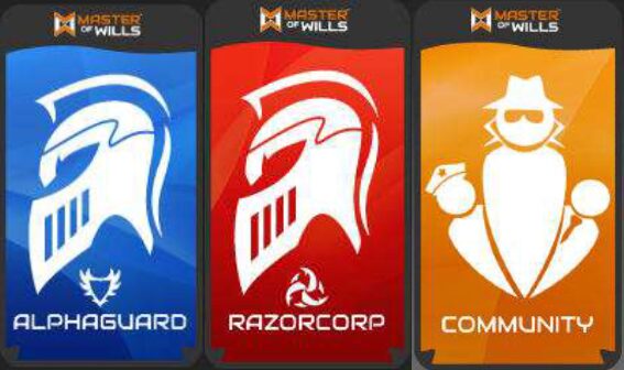
Usually, tarot-size cards are used in lieu of poker standard in TCGs with religious or occult themes or to provide more room for gorgeous, elaborate artwork. Master of Wills, a game with a cyberpunk setting and the card backs you see before you, is obviously using them for a secret third reason known only to the game’s creators and, presumably, Moloch.
#158: RONE
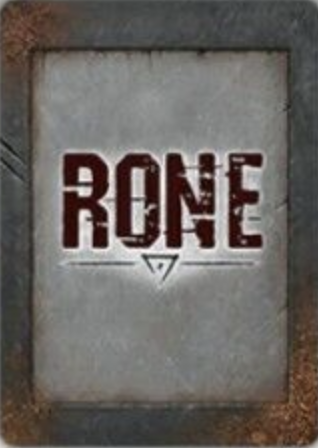
More like groan. There’s almost nothing to like here. The font and the little symbol with the underline aren’t bad, but the rest is metal on metal, with some frankly chonky borders and a strangely recessed look to the card’s inner frame. The whole design looks like something you’d see on a pack of cigarettes— a cruel reminder that you could be halfway to a nicotine addiction for less than it costs to buy one booster pack of your chosen card game.
#157: Inscryption (Act II)
Including Inscryption’s Act II card backs on this list feels like an act of bad faith perpetrated against an amazing roguelike deckbuilding game. You almost never see your card backs in this portion of the game, which is styled like an 8-bit RPG, and you’d be forgiven for not remembering them. They are almost wholly blank, save for a simple decorative border. The fact that it beats over the previous five TCG backs should tell you more about those games than this one.
#156: Precious Memories
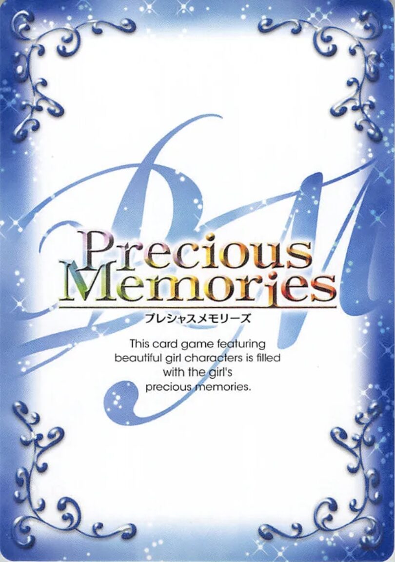
Precious Memories has the first card back on this list that really goes for it. It’s got sparkles. It’s got swoopy vine embellishments. It’s got three different fonts and one of them is rainbow. If these elements all worked together instead of looking like three different layers of design theory, it might have worked. At least we get the amazing line, “This card game featuring beautiful girl characters”, which kind of feels like saying the quiet part out loud, no?
#155: Godzilla
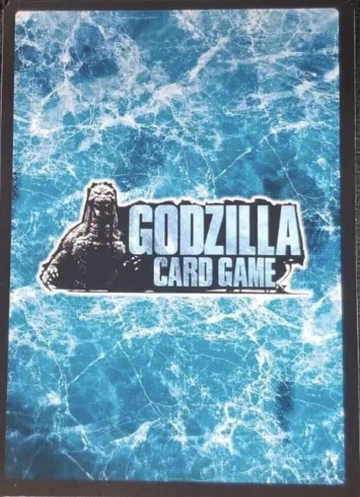
If you tried making Godzilla this small on a trading card in my house you’d be shot.
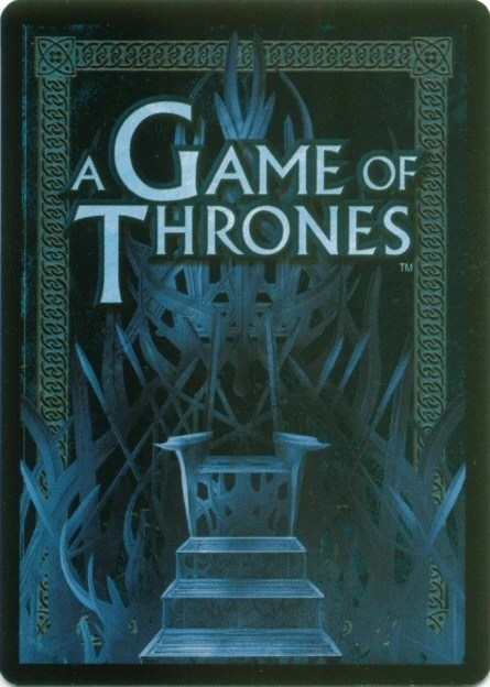
#154: A Game of Thrones (2nd Edition)
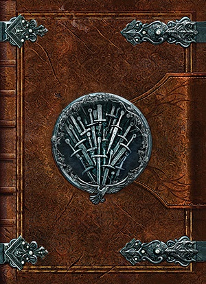
The problem with making your backs look like an old leatherbound tome is that cards are inherently not that. They are palm-sized and two-dimensional, and though some may contain as much text as a chapter in A Game of Thrones, the best you can hope for with this design is the brief illusion that a full, perfectly straight deck is actually a tiny book. Aside from that little thrill, the leather texture adds way too much visual noise, while the fake binding and clasps muddle the already faint border, an element very few card backs can afford to do away with— though we’ll see many more that try.
#153: The Lord of the Rings
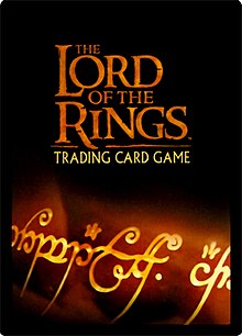
For a Lord of the Rings TCG that released in 2001, this back could have looked much worse. Instead, what we get is the game’s title on a black background and the fiery shimmer of the One Ring below it. The colors sure do pop and neither element clashes, but the positioning of the logo in the upper half makes this look like a promotional Lord of the Rings-themed deck of playing cards you would find half-off at a garage sale for inexplicably missing a Queen of Diamonds and two Sevens.
#152: Megacorp
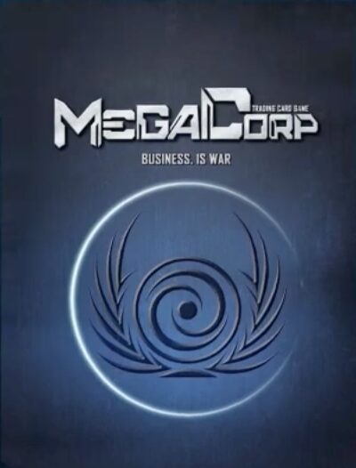
If you’re going to try to usurp The Ball, you damn well better not miss. Megacorp, you missed.
#151: Dragoborne
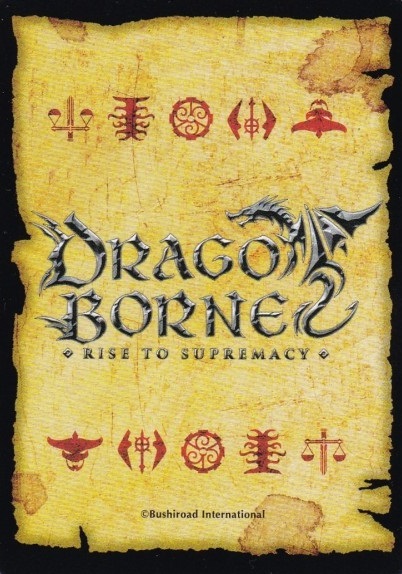
I’ll admit, I’m a sucker for horizontal symmetry in a card back; it means your design can never be viewed upside down. The mirrored sets of five symbols on the top and bottom of the card seem to be going for that, but it doesn’t exactly work, on account of the massive Dragoborne logo in the center. The font is actually so overwrought I think trying to read it upside down would give you a stroke, which funnily enough is also what you’d get long before ever finding another human who plays Dragoborne.
#150: Genesis: Battle of Champions
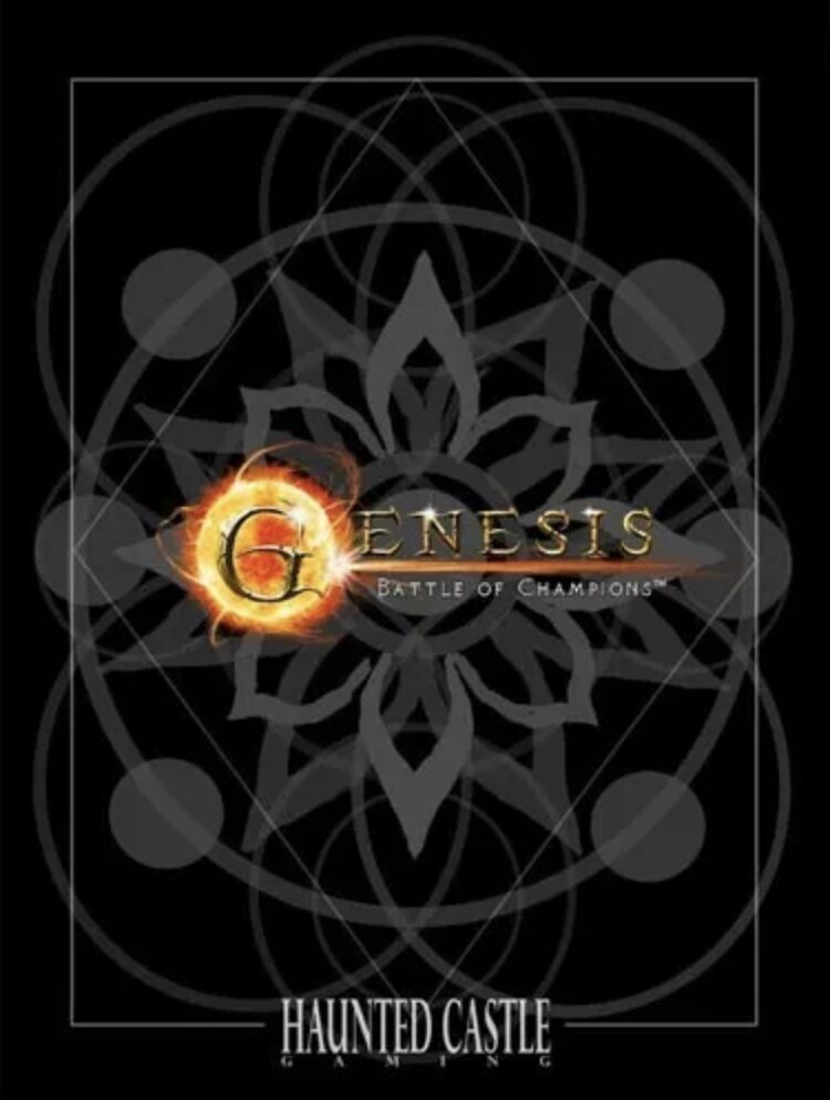
Biblically-accurate card back.
#149: Fight for Olympus
Look, I love 7 Wonders. If I say this looks like a card back that belongs in 7 Wonders and I mean it in a bad way, will we all be cool about it? There’s no identity here, no completed vision. It looks like it belongs in a “game that includes cards”, not a card game.
#148: Dice Masters
It doesn’t offend me, but that’s about it.
#147: Animus (Back #1)
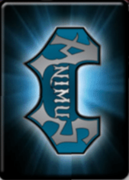
Animus has two different card backs, as far as I can tell from a game with a dead website and horrible SEO (Magic: The Gathering has at least five different cards with the word “Animus”, apparently). I’m not sure if they come from two editions of the same game or two similar but different games under the same brand. Regardless, this one is worse. I warned before about aligning your text vertically on a card back, and it’s just as awkward here. At least the blue glow on black and the batarang-shaped logo are fun to look at.
#146: Legions of Will
Did… did it just wink at me?
#145: Gate Ruler
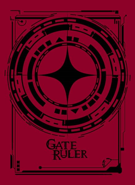
Gate Ruler almost has a good card back. It actually gets so close I’m comfortable calling this a tragedy. There’s a big, eye-catching symbol front and center, memorable colors, no wasted space. Unfortunately, the end result is so… flat. There’s no dimension here; everything feels like one layer. It’s like staring at the silhouette of a card back— the shadow of a perfect design.
#144: Battle Spirits Saga
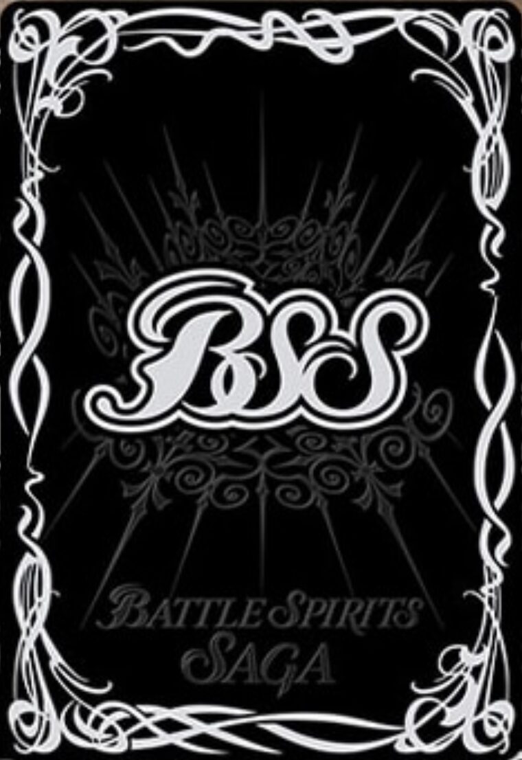
It’s humbling to know there is such a thing as too much border on a card back. But I’m more confused by the words Battle Spirit Saga placed way down at the bottom, which looks less like a title and more like a watermark someone forgot to remove on their black background stock photo.
#143: Star Trek
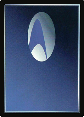
Where’s the rest of it??
#142: Transformers
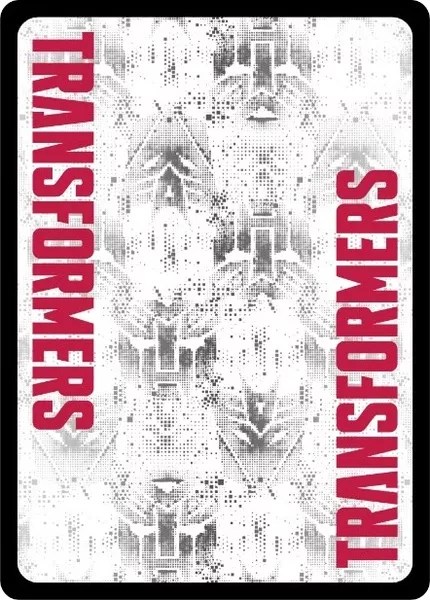
Our first fully symmetrical card back (not counting Inscryption)! I actually don’t mind the vertical text here, and the colors are perfect for Transformers. Despite the Autobot and Decepticon symbols, the center ends up looking fairly empty, which unfortunately contributes to the “branded deck of playing cards” vibe. Some kind of prominent central logo or design could’ve neatly filled the space, in the same way the last Transformers movie “filled the space” where a critically-acclaimed blockbuster could have been.
#141: Raw Deal
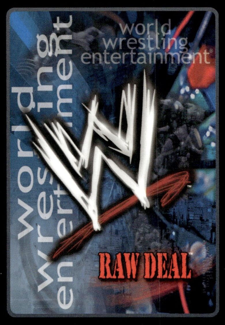
Did you know the WWE had a card game? If not, the words “World Wrestling Entertainment” appear twice on this card back in two different orientations and kernings, that way you and your friend sitting perpendicular to you aren’t left out of the loop.
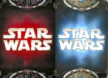
#140: Star Wars: Customizable Card Game
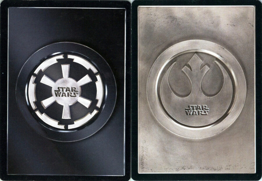
We’re only on the second Star Wars TCG and I’m worried my enthusiasm peaked with the first. At least the floating heads were funny. These backs look like “teaser images” Disney would tweet out for a TV show that won’t be airing for another two years.
#139: Warlord: Saga of the Storm
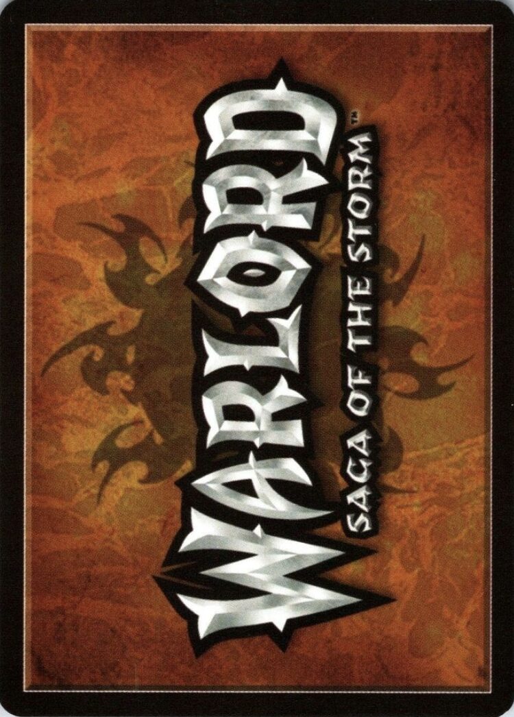
Be careful not to cut yourself on that font, children.
#138: Dominion
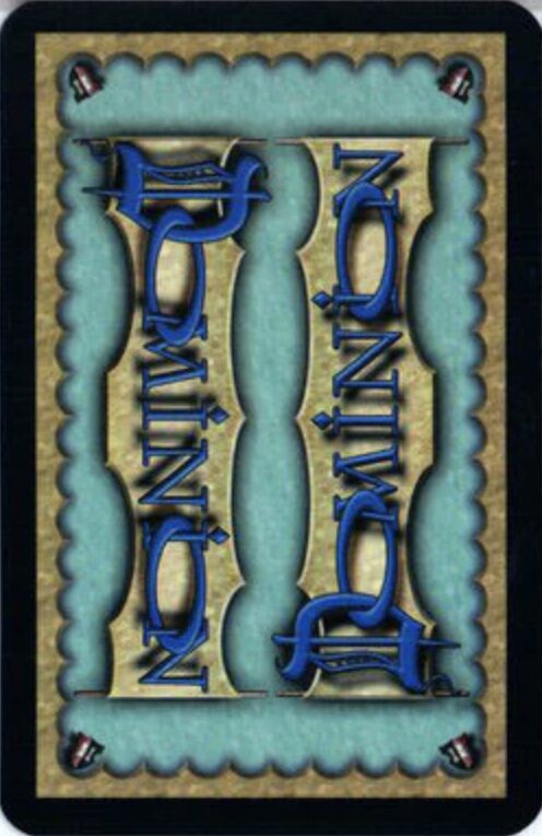
Is Dominion a TCG? Not really. Would I play it over 90% of the games on this list? Unquestionably. I really love the crinkle-cut border on this back, and the colors are instantly attributable to Dominion. The star of the show, however, and by star I mean perversion of nature, is the Dominion logo itself. Just what is going on here? Why is there a drop shadow? Why are the Os doing that? Did the other letters consent? Was the goal to get “The Dominion Challenge” trending, a viral stunt where teens film each other trying to read the word Dominion on the card back all the way through without succumbing to madness? It’s never been done by the way: you could still be the first.
#137: Deadlands: Doomtown
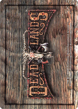
This is an example of a back that looks pretty good close up but gets noisier and noisier the further you zoom out. It’s important to remember that just like card art, card backs are not standalone works. They don’t exist outside the context of a trading card. You’ll see them from far away, stacked up, upside down, overlapping, fanned out, creased, pringled, sun-bleached, torn in half, taped back together, and passed off as “lightly played” on TCGPlayer. The design has to hold up in all of those instances.
#136: Thalara: The Last Artifacts
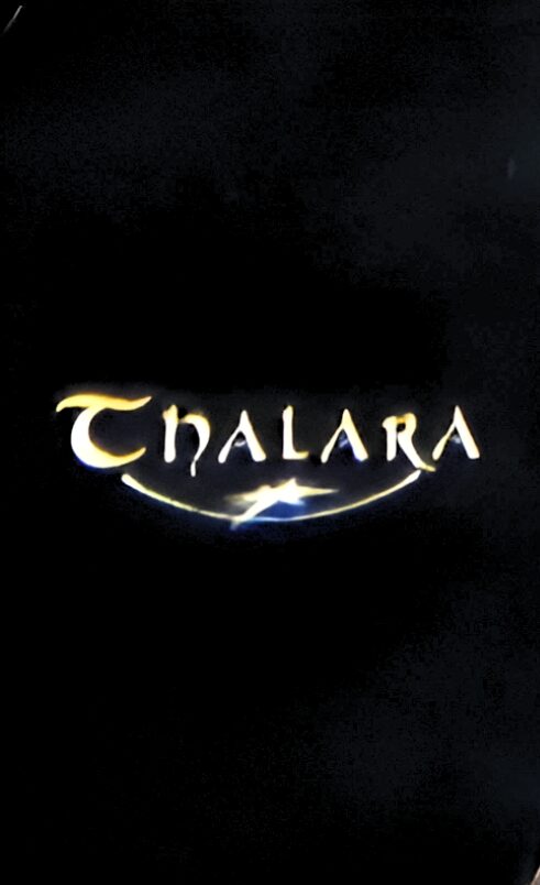
A simple black background isn’t a bad choice for a trading card back, but it probably shouldn’t be the only choice.
#135: Crimson Company
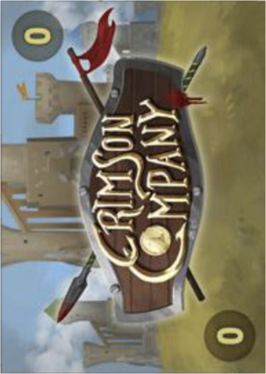
It’s giving “mobile game”.
#134: Spellfire: Master the Magic
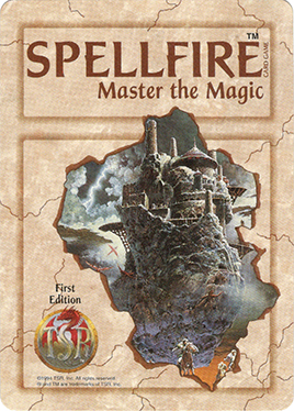
Spellfire: Master the Magic is a poor case for “respect your elders”. Released in 1994, it was the second CCG to ever hit the market after Magic: The Gathering, and it stands strong to this day. That is, if this day was 1997, which is when the game’s final expansion released. In a way it was doomed to fail, coming right after Magic and sporting a card back that looks like a rulebook. Why is there so much stuff on it? Why is the art booted to the side to fit the TSP logo? Why is there an unreadable bit of copyright jargon below that?
Fortunately, for anyone who longs to immerse themselves in the world of Spellfire, you can actually still play the game it was based on: a small TTRPG called Dungeons & Dragons.
#133: Zatch Bell!
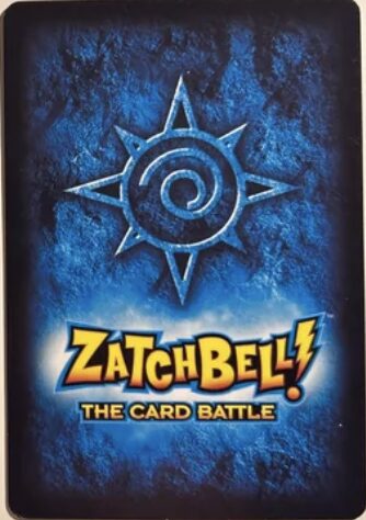
Any Zatchers out there? Any Bellheads? Where’s the Zatch Patch at?
Hey! Your card back is okay!
#132: Z/X
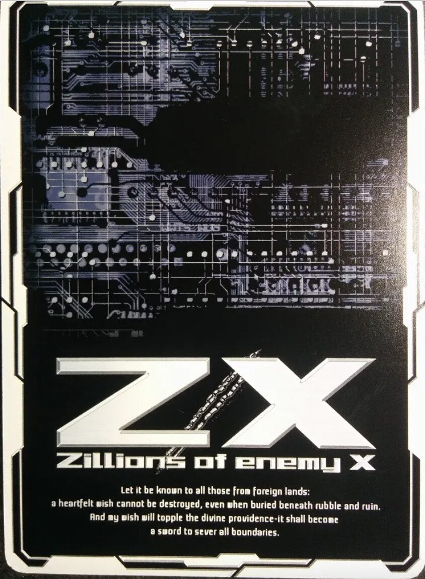
Z/X (otherwise known as the impeccably silly Z/X Zillions of enemy X) is another waifu TCG, but good lord, you would not know it looking at this angsty card back. I like the harsh white on black, the intricate techno border, and the insane choice of making the card bottom-heavy. And then there’s this paragraph of text that low-key goes hard: “Let it be known to those from foreign lands: a heartfelt wish cannot be destroyed, even when buried beneath rubble and ruin. And my wish will topple the divine providence— it shall become a sword to sever all boundaries.” I feel compelled to reiterate that the core aesthetic of this game is, again, waifus.
#131: Silver Wing Legacy
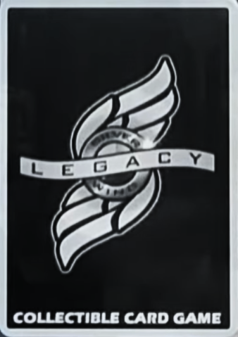
The more I look at this card back, the more it grows on me. The silver and black fits the military theme, and the design of the wings fills out the space in a pleasing, symmetrical way. Silver Wings Legacy could have ranked higher, if not for the distracting “Collectible Card Game” at the bottom— as if players were at risk of confusing a palm-sized deck of cards for the book series this game is based on.
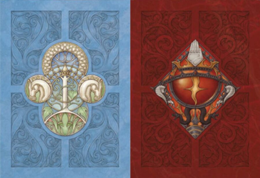
#130: Star Wars: The Card Game
Another Star Wars game, another mediocre card back with a light and dark side variant. The hemispheres on the top and bottom give the back a unique frame, at least. My favorite detail is how the hemispheres on both cards are designed slightly different from each other when they absolutely did not need to be. Playing spot the difference feels like learning about the aesthetics of what makes “good” and “evil” tech at the world’s tiniest TED Talk.
#129: Final Fantasy
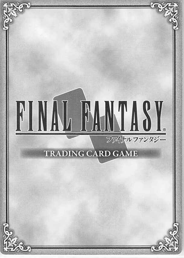
I try to live my life knowing as little about the Final Fantasy series as possible and I will not betray that ideal now. This is fine. It’s gray on gray. It’s vaguely metallic. It’s ornate. It looks more like a card sleeve than a card back. Does that make sense?
#128: Epic Card Game
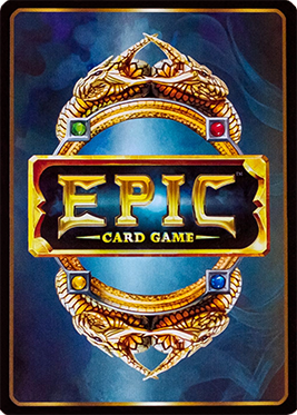
Did Las Vegas commission this card back? Remove any one element and you’d have a decent enough design. Just scrapping the title or shrinking it down in the center would get you halfway there. As it stands, I’d rather make out with a slot machine than stare at a hand of cards that look like this.
#127: MetaZoo
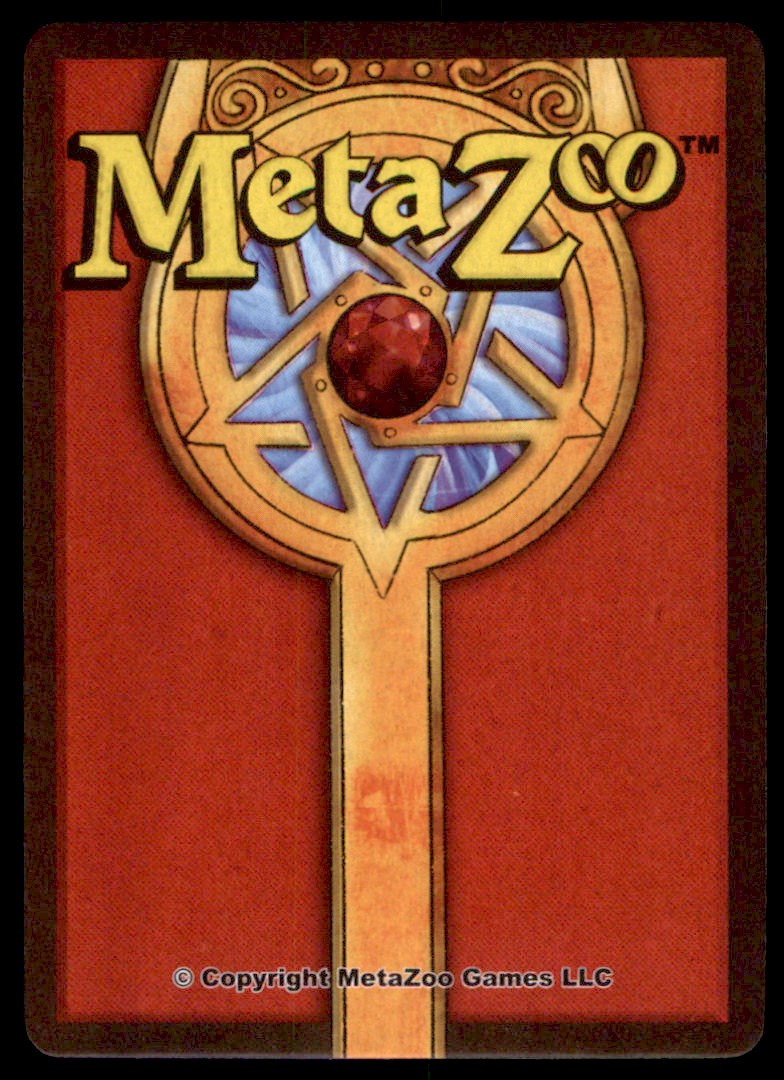
Looking at this feels like catching a card game with its pants down. Oh, MetaZoo. Why are you so silly? And why do I kind of like what I see?
#126: Neopets
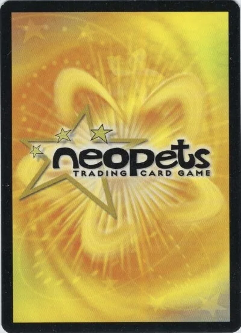
It’s fun, it’s playful, it shares over 60% of its DNA with a banana. Everything is ever-so-slightly off-center, as if to say, look at us. Don’t you remember us? Remember the fun times we had together? Remember getting your pets breakfast at the Giant Omelette before school? What happened to those simple days, Niklas? It’s been so long. Your JubJub misses you. Come home.
#125: Warhammer Age of Sigmar Champions
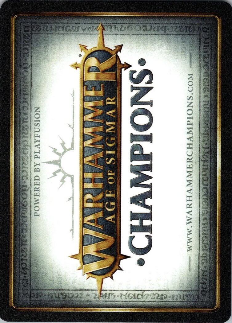
I ain’t reading all that.
#124: Codex: Card-Time Strategy
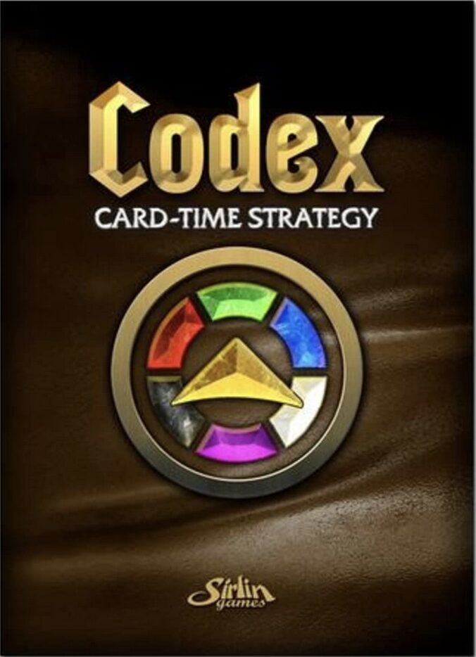
The card back for Codex: Card-Time Strategy establishes an important motif you’ll see more of as we ascend the pantheon, that being: Central Thing surrounded by five or six Colored Things. Many of my favorite card backs follow this design, and that’s because it works— creating a memorable symbol, unifying the design, and adding a splash of color. Codex stumbles despite this boon, sporting a weird leathery background and History Channel-ass font.
#123: WIXOSS
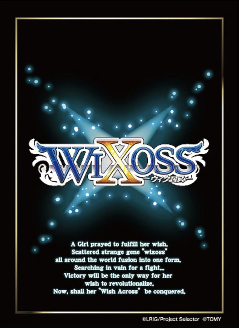
WIXOSS (however you just pronounced it is wrong, by the way) has a very pretty card back! The logo is beautiful to look at, as is the faintly glowing X shape that serves as the background. I’m not a fan of the gold border though, and the nigh-incomprehensible text—though charming in an insane kind of way—makes the card very bottom-heavy, which coincidentally doubles as an accurate description of some of the women featured in the card art itself.
#122: Duel Masters
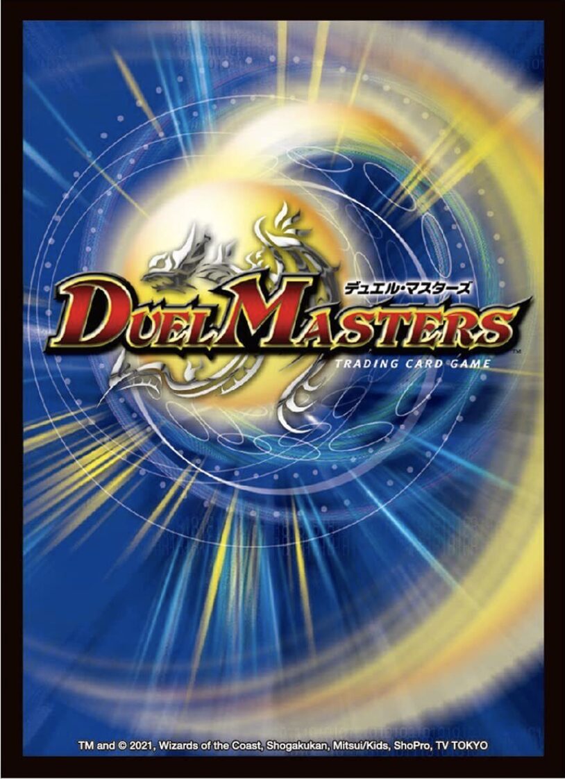
Duel Masters… Duel Monsters. I am as yet unconvinced this game isn’t Yu-Gi-Oh in disguise. The card back even depicts a kind of Pokémon-infused version of The Swirl. And who’s that lurking in the center of the card?
Could it be… a powerful engine of destruction?
#121: Hearthstone
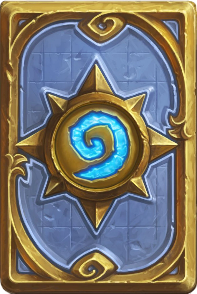
Hearthstone has more or less 1 billion different card backs players can unlock, but this is the Classic. Also known as the Basic back, which is the more fitting term. There’s nothing special here, but it’s perfectly serviceable. These cards are designed to be viewed at a smaller scale, which works well with the thick borders and lack of text, though the 3D look and blue/gold colors have an “online-only card game” sheen that I find… unpleasant.
#120: Munchkin
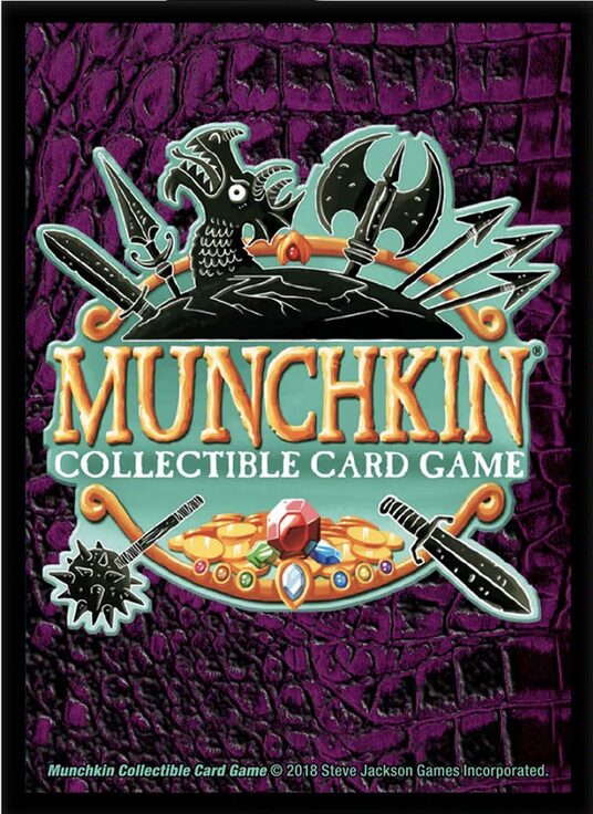
Weird. Colorful. Slightly upsetting. That’s Munchkin, baby. Anything is better than looking at the actual art on these cards, though.
#119: Arkham Horror: The Card Game
Arkham Horror: The Card Game has one of the strangest card backs on this list. If I saw this design without context, I would bet money it belonged to a game where you assemble a fleet of celestial princesses whose bodies are also spaceships as they war over the Cosmic MacGuffin at the center of the universe (also a princess, but insufferably naïve). It would be called Planet Captive Princess! I would consequently lose this bet as I found out this was the card back for a Lovecraftian horror game set in the 1920s. It’s interesting, at least, and they don’t call the genre “cosmic horror” for nothing, but choices were certainly made. The jagged “corner borders” in particular are a design no stable mind would dream up.
#118: Flawed
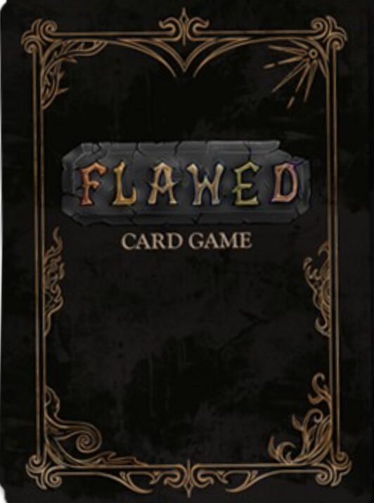
Rule #1 for creating any product is don’t name it something a reviewer can make a pithy pun about in their one-sentence blurb. Rule #1 for designing a card back for a TCG named Flawed is don’t put the words “Card Game” below the title so as to make it read “Flawed Card Game”.
#117: SiegeStorm
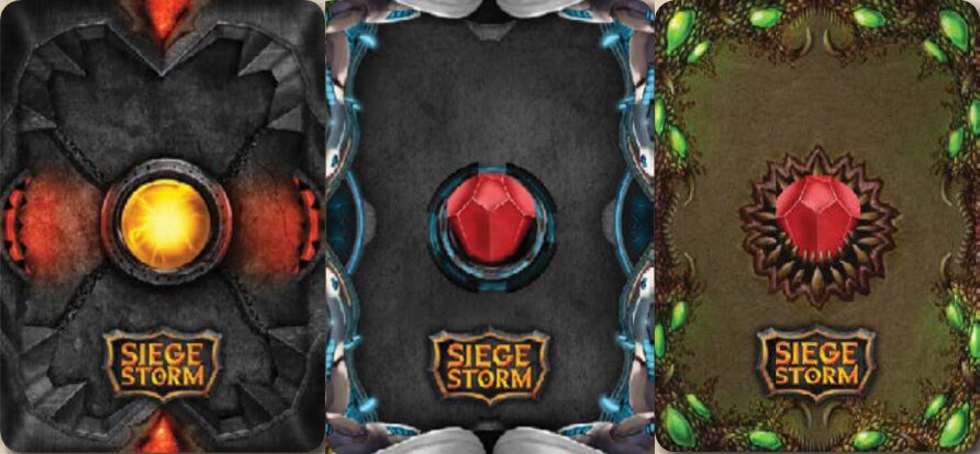
SiegeStorm has a lot of card backs (a different one for each character, I think?), but they all share common design elements. While I’m ambivalent to the Ring Pop in the center, the many unique and thematically distinct borders are fun to look at.
#116: The Elder Scrolls: Legends
If you’re too afraid to look up news about The Elder Scrolls VI for fear of learning just how sharply Bethesda is pivoting to get the next Fallout game delivered to gamers via emergency caesarean before all good will from the TV show is lost, you could always turn your attention to The Elder Scrolls: Legends— an online-only card game with this shiny if unimaginative card back. It looks like currency. Like a door you’d find in a witch’s house. Like a limited-edition book with the dust jacket removed. Like a defunct 2017 cash grab Hearthstone wannabe— wait.
#115: SolForge Fusion
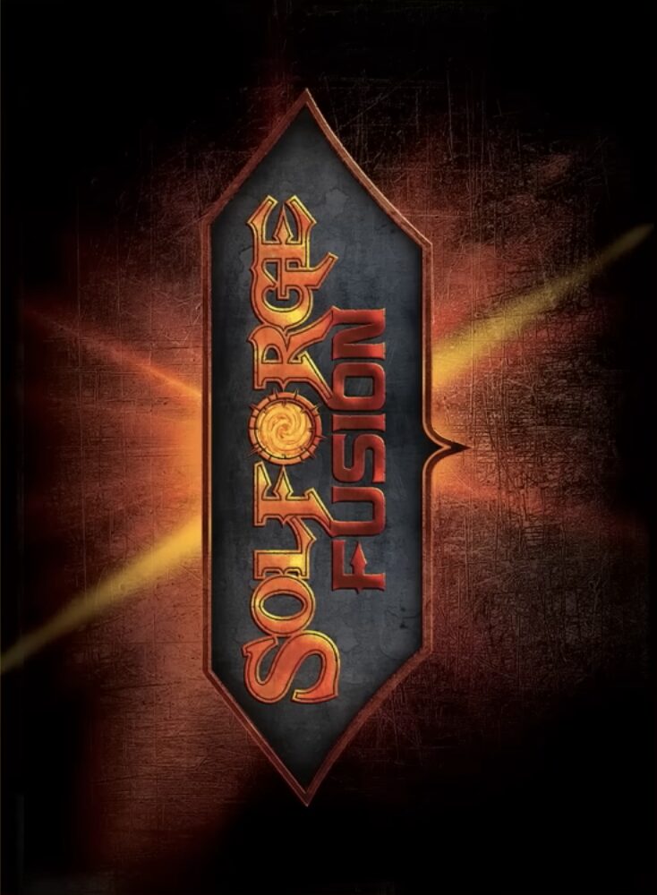
If you don’t have anything nice to say, don’t say anything at all.
#114: Marvel Champions
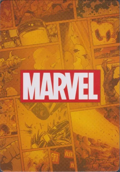
Leave it to Marvel to produce the most generically palatable card back for what has become a generically palatable franchise.
#113: Star Wars: Destiny
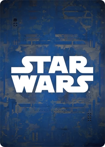
Leave it to Disney to produce the most generically palatable card back for what has become a generically palatable franchise.
#112: Battle for Sularia
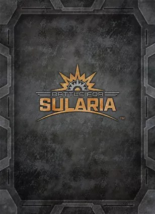
Battle for Sularia sounds like the title of a fake video game used for one episode of Mythic Quest and never mentioned again, but this card back is okay. The industrial grunge aesthetic is a little colorless and oppressive, but the stylish logo is a fitting centerpiece.
#111: Animus (Back #2)
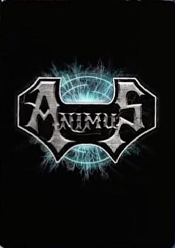
This is the second back for Animus, and I think you’ll agree it’s leagues better than the first, in that the text is no longer vertical.
#110: Weiss Schwarz
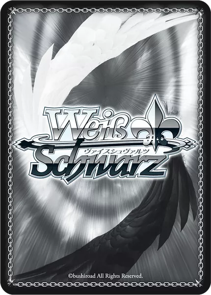
I’m told Weiss Schwarz is a decently popular TCG and not, as the name would suggest, a law firm, weapons contractor, or character in Attack on Titan. “Weiss” and “Schwarz” translates to “Black” and “White” in German, though a more fitting name might’ve been Grau Grau, considering the predominant colors of this card back. It gets the job done though.
#109: Dinn
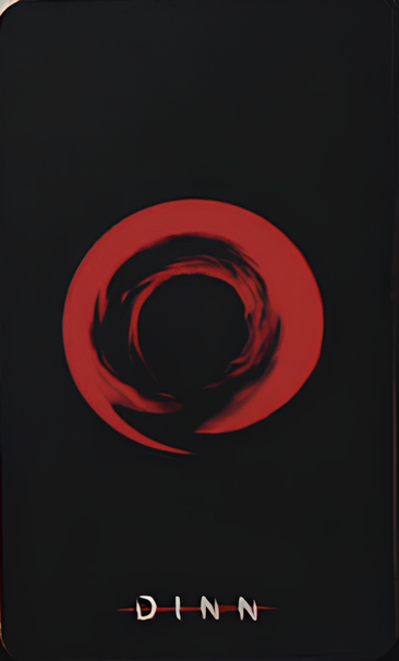
I think everyone reading this list should check out Dinn. Not because of this simple if evocative card back, but because I wrote “super cool” next to its name in the notes I compiled for this list. That’s because almost every card in Dinn supposedly contains a secret puzzle to solve that contributes to a “multi-media spanning ARG (Alternate Reality Game)” that exists at the core of the game. Now isn’t that dope as hell? And fitting, for a game themed around myths and ancient history. To be honest, I didn’t do much digging into Dinn because I knew what I’d likely find: evidence that the game barely took off and fizzled out just as fast, which would be so sad for a TCG with a gimmick this cool and made with obvious love.
So, I didn’t look into it. Maybe it’s still running. Maybe there’s a dedicated community. Maybe the creators are deep into their next project. Or maybe, this is a memorial; an ode to trading card games made by passionate teams or individuals who put it all on the line for the little game that could, or tried. If that’s the case with Dinn, as it is with so many of the games on this list, consider sparing it a kind thought, as you would passing a stranger’s grave, and take a moment of silence here as we make our way to less troubled ground.
#108: Elementa Arcanum
…
#107: Summoner Wars
…
…
#106: Deck of Wonders
…
#105: NFL Five
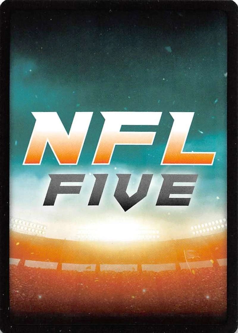
Yeah, this one deserved to die.
#104: The Supershow
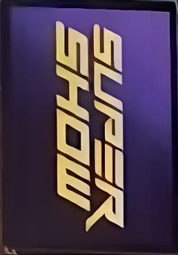
Maybe I’ve been staring at it too long, but I think The Supershow has somehow designed a font that’s more legible vertically than horizontally. Turn your computer on its side and tell me I’m wrong.
#103: Akora
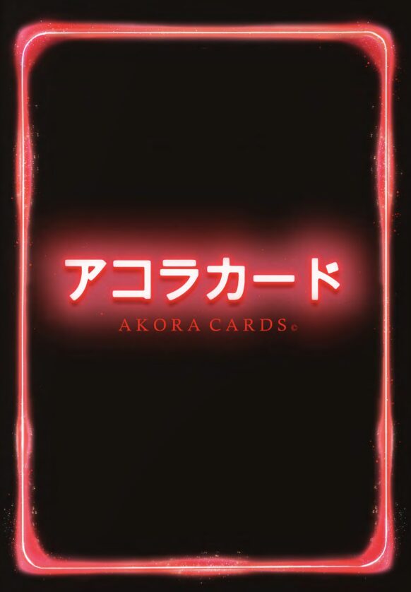
If it weren’t for the English translation, I’d assume I was being threatened by this stark, neon-infused design. You can’t deny it looks cool, at least by adolescent standards. It has an immediacy and confidence I admire, even if those same traits could also be found in a traffic light.
#102: Star Wars: Unlimited
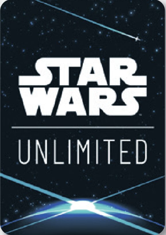
Little more than a glorified logo, but I suppose that’s all Star Wars really is at this point.
#101: Yomi
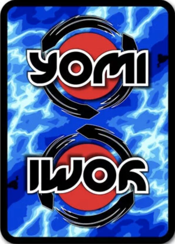
I do love perfectly symmetrical card backs, but Yomi takes it a little too far, feeling less like a complete and unified design and more like one design copy-pasted twice. That’s a shame, because the logo already has a pseudo-symmetry that would’ve worked on its own in the center, and the eye-popping background (which changes for different decks) is electric and enthralling.
#100: Zombie World Order
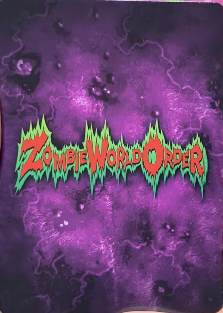
First off, let it be known that Zombie World Order kicks ass. A trading card game themed entirely around zombies with a novel revival mechanic and zany, maximalist artwork should be worth playing, no? Apparently not, because it is very much dead. I choose to believe it was a good game on vibes alone, and I submit this vibrant, kooky, Goosebumps-ass card back as evidence of that fact.
#99: Star Wars: The Trading Card Game
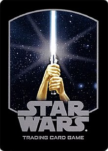
An elegant card back for a more civilized age.
You would be forgiven for confusing Star Wars: The Trading Card Game with Star Wars: The Card Game or Star Wars: Customizable Card Game, or Star Trek.
#98: Allegiance: A Realm Divided
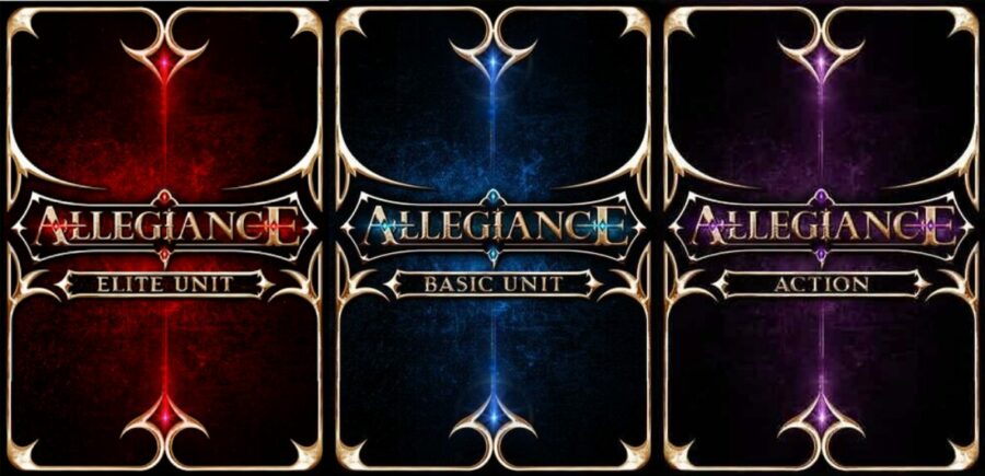
Divided among three over-designed card backs, more like.
#97: Marvel Snap
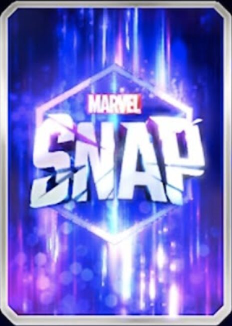
Pros: Bold, colorful.
Cons: Visually noisy, one-note, all money goes to Disney. Capitalism is a Many-Toothed Maw and Disney is the tongue that wets its lips.
#96: Pocket Paragons
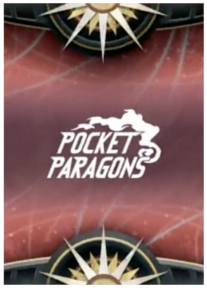
Another case of a card back framed by two hemispheres on the top and bottom, but I like these hemispheres a lot better than the ones on Star Wars: The Card Game. Here they extend further into the design, with the rays of what I assume are suns poking up onto the background like stately medals adorned on the breast pocket of a proud paragon, or something, I don’t know how the name fits into any of this.
#95: Vanquishers
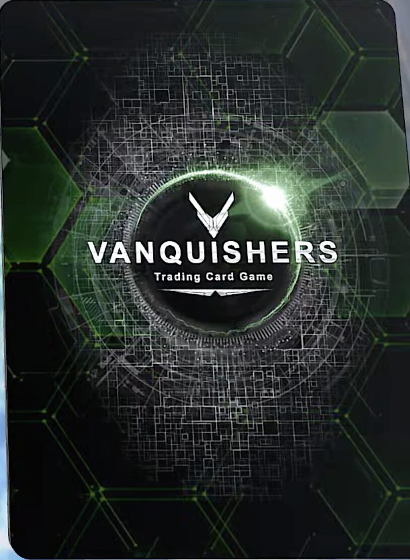
Vanquishers has a cool green overlay effect that gives it a unique sci-fi flair, though the card back as a whole could use a border of some kind. That, and the logo leaves something to be desired. Why so small? Are you shy, little guy? Where are your parents?
#94: Paragon: Trials of the Chosen
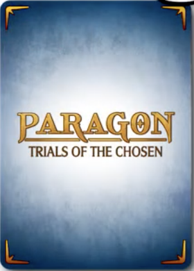
Would you believe that there’s another, entirely separate TCG about “paragons”? Released only one year after the first? Were there two teams working unaware of each other’s existence? Or was Paragon: Trials of the Chosen created specifically in response to Pocket Paragons, a martyred game meant to muddy the waters of SEO in preparation for the arrival of a third, cataclysmic “paragon” game? A game that, if ever discovered—either by accident or by someone doing research for a listicle—would sear the true face of God into our eyes: that Face which is red, raw, and grinning; that Face which is only a Face so much as a scream is a laugh. It is best we make as many “paragon” TCGs as possible, before that day comes when not even the Raptured are safe.
#93: A Game of Thrones: The Card Game
Look at those cool blue tones! Refreshing!
#92: Pixel Tactics
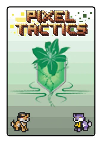
I couldn’t exactly tell you what Pixel Tactics is about, but it sure looks fun. This is one of multiple backs (different backs for different decks?), but they all share the pixel art style, chunky gradient, and a central colored symbol themed for the deck. I don’t know what the two characters on the bottom are—they seem to change per deck—but they give balance to an otherwise top-heavy design. All of this is wrapped in a vanilla white border, a refreshing change of pace. Card borders, like tires, are almost always black, so it’s nice when a Lightning McQueen comes along to shake things up.
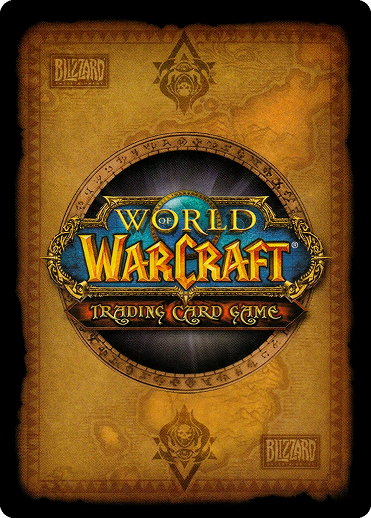
#91: World of Warcraft
Every time I look at this back, I think, “Damn, this is kind of ugly.” Then I look at all the backs that came before it and I think, “Well, it’s kind of nice I guess?” Then I remember it’s World of Warcraft and I look at the Blizzard logo in the corner and think, “Would they pay me to rate this higher?” and I bump it up a few places just in case.
#90: Omni
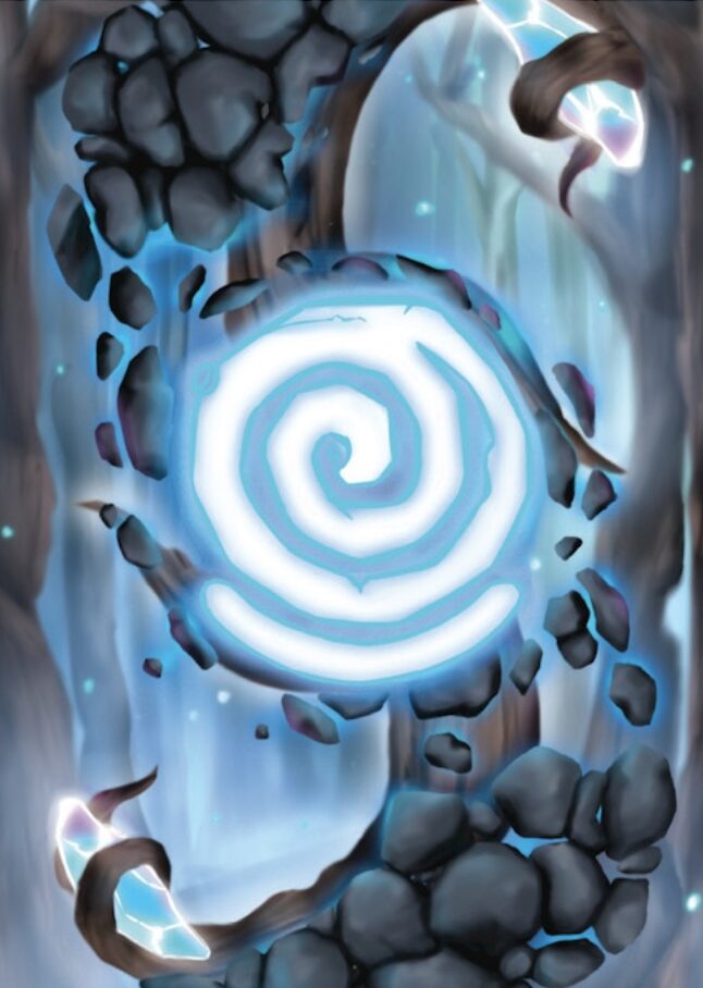
I’m not entirely sure what I’m looking at here. I see a tree, stones, and what looks like water, but is that water or is it ice, and is that ice or is it crystals? Whatever it is, it sure could use a border.
#89: Birthright: Alliance of Lords
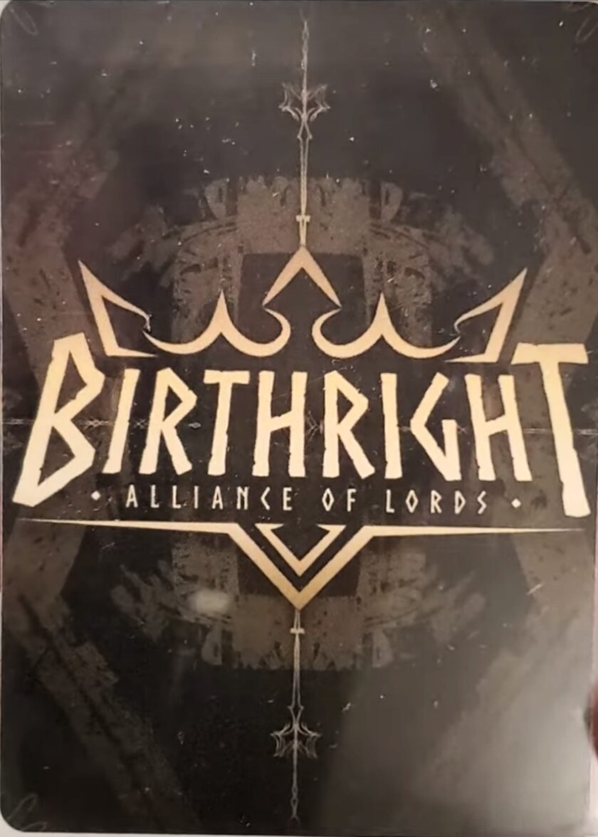
I sometimes think about the people scrolling through this list at the speed of sound, reading and comprehending nothing save for a whoosh of light, only stopping when they see their favorite card game so they can find out where it stands in the ranking, bask in the light of their own opinion, and then return to their day.
Statistically and against all odds, there must be one person whose favorite trading card game is Birthright: Alliance of Lords. If that’s you, and you scrolled this far just to see what I had to say about the game that has shaped your personality, cost you friends, and stuck with you when God and everyone turned their backs, drop your Venmo in the comments and I will actually, genuinely send you $10 because I have nothing to say about this back.
#88: Card Kata
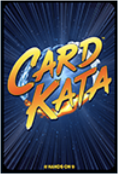
Other TCGs have cards with names like “Urtica Cipher” and “Amorphactor Pain, The Imagination Dracoverlord”. Card Kata has “Punch” and “Kick”. So you’ll agree the speed lines and loud comic book font are perfectly appropriate here.
#87: Academy of Arts
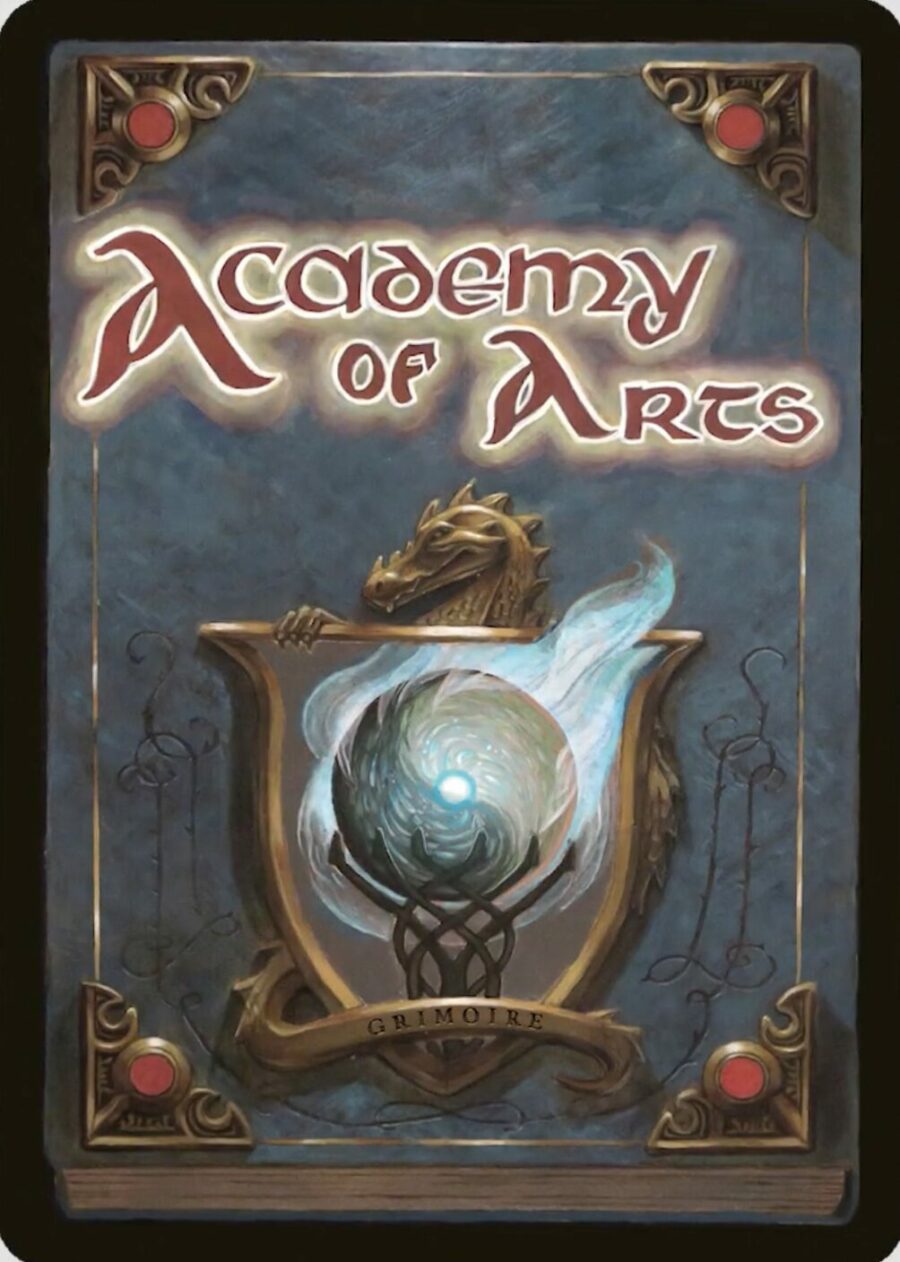
I love cards that look like the covers of the old children’s hardbacks that would whisper to you from the big center table at the Scholastic Book Fair; the books promising a Big Boy adventure that couldn’t be found in the wafer-thin picture books populating the shelves, if only you were brave enough to part with mom’s fifteen dollars. In that extremely specific regard, Academy of Arts has a card back that exceeds expectations and brings a warm nostalgic joy to my heart. I do have to wonder about the nature of the book depicted here, since the binding seems to indicate it reads right to left. Perhaps it’s a manga?
#86: Harry Potter
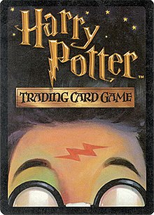
If you don’t have a handful of these cards lying around in a closet somewhere like the corpses of dead frogs in a swimming pool, can you really say your childhood was well-lived? I don’t think anyone played the official Harry Potter Trading Card Game, but that doesn’t mean there weren’t a lot of people doing their best work to bring it to life. You can feel the love for the franchise in this playful, inspired card back, which channels the whimsy of the original book covers and combines the series’ most popular images—the round white spectacles, the revealed forehead scar—into one cohesive, unique design. I don’t think it totally works as a card back, per se, but as a piece of art and a reminder that loving Harry Potter used to not be a red flag, you can’t get much better than this.
#85: Magi-Nation Duel
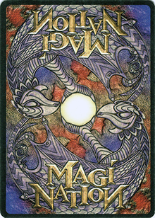
A defunct TCG published in the year 2000, Magi-Nation Duel hoped to corner the market of kids looking to transition from Pokémon to Magic. Its fatal mistake may have been the assumption that any parent would let their kid invest in three different trading card games, and it probably didn’t help that Magi-Nation Duel has card art I can only describe as Neopet-core (derogatory). This card back was not part of the problem, though. It manages to make the game feel “classic” despite all existing evidence to the contrary.
#84: Legends of Runeterra
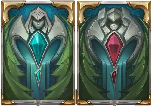
A card back reminiscent of an artifact Indiana Jones would switch out for a bag of sand, which is also the approximate worth of your digital collection when Legends of Runeterra shuts down.
#83: Ardent Reapers
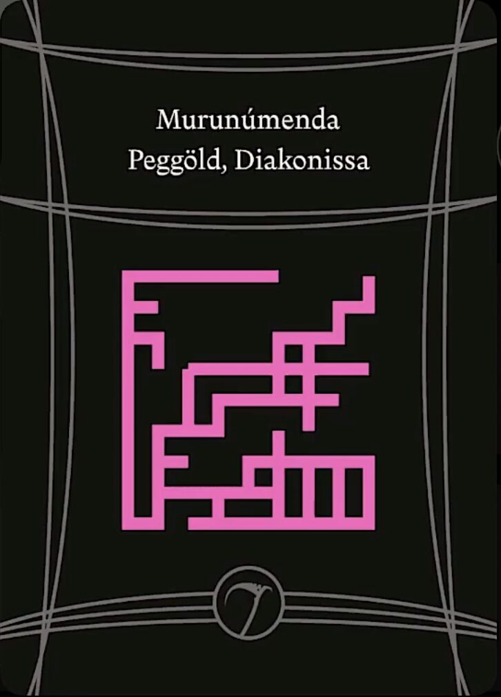
Decks in the print-and-play TCG Ardent Reapers are procedurally generated and totally unique, with players getting two decks when they make an account and one free deck every month, and even the rules aren’t set in stone. If that sounds like a sponsor read, remember that no company in their right mind would pay me to put their game at #83 in a Best Card Backs list. I bring up Ardent Reapers’ premise mostly because I think it’s cool, but also because it inspires this simple yet oddly appealing back design, which is unique per deck, with the shape and color of the maze changing along with the words at the top of the card. The wispy framing lines are a questionable choice, as is the decision to use what looks to be AI-generated art on the cards themselves (it’s on theme, and for what it’s worth this is back when AI art was largely impressionistic and had some mystique, but still), however Ardent Reapers gets a pass from me on account of it being a passion project with an extremely small to nonexistent player base. No use beating a dead tree that no one heard fall.
#82: Challengers!
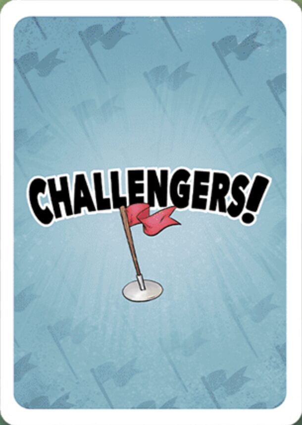
Now, Challengers! is a game I absolutely will accept sponsor money for, and that’s because I’ve played it and it rules. It’s a deckbuilding board game that perfectly encapsulates the thrills and mechanics of a draft tournament, with players each constructing their decks a few cards at a time, facing off for points, tweaking, adding new and better cards, and going again. A sequel came out recently, so there’s no better time to pick it up.
And this card back? It’s fun. It captures the game’s comic strip aesthetic well. Although once you see the flag is slightly off-center, you can’t unsee it.
#81: Inscryption (Official Promo Cards)
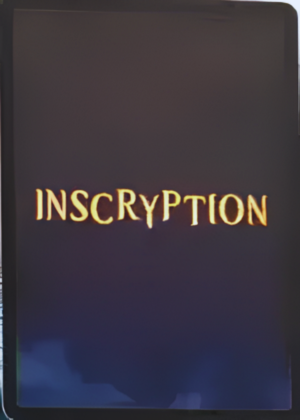
If you finished Inscryption but never tugged at the thread that is “Can you buy this card game in real life?”, then your mind is safe from the tantalizing knowledge that there exists, on Etsy, an entire IRL Inscryption marketplace, from which you can buy full 300-card sets for a two-player game, complete with playmats, maps, scales, blood and bone tokens, and emergency squirrels. Luke Carder may have died, but his life’s work continues.
This card back is from neither the game nor Etsy. Instead, this is the back designed special for Devolver Digital’s collectible Inscryption booster pack, available for purchase on their website. The card art and layout are different from the game, but no less evocative, and it’s the same with this back: the glowing gold letters surrounded by creeping darkness all but invites you to return to the embrace of Leshy’s cozy, OSHA-noncompliant cabin.
#80: VS System
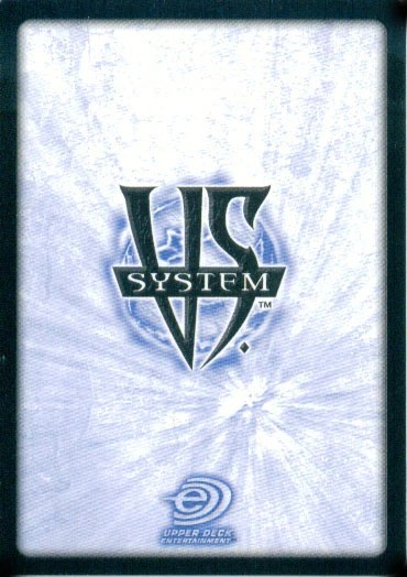
Decent back, terrible name. Come on guys, let’s go play VS System! No.
#79: Naruto Boruto
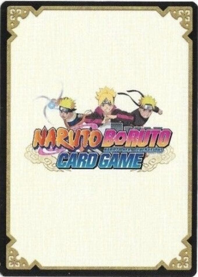
Nothing to write home about, but even if you did, your mom would be saddened to hear you’re still ranking cardboard for the video game site.
#78: Middle-Earth
Someone cooked when they made this back for Middle-Earth, a Lord of the Rings CCG from 1995. The design is stupid simple, but that’s part of the charm. It’s an overwrought middle school doodle brought to agonized life, with every glance reminding you there was a tender point in your life when this was the coolest a card back could ever look.
#77: Slay the Spire
Like many video game deckbuilders, Slay the Spire’s card backs don’t actually appear in core gameplay, but they can be glimpsed once on your long and arduous path to losing on turn two to the Heart: during the Match and Keep event, where you’re tasked with flipping over cards in a grid and matching pairs to add them to your deck. It’s not a stretch to believe the card back was designed solely for this mini-game. If it was, unlike my last Claw deck, it wasn’t half-assed. The muted colors are an odd choice for a game with such bold, kinetic art, but the Spire makes for a fitting if abstract centerpiece. It just doesn’t quite fit the eye-popping, playful aesthetic of the game to me. I turn this over and expect to see a wedding invitation, not a Deus Ex Machina with the goofy beta art turned on.
#76: Riftforce
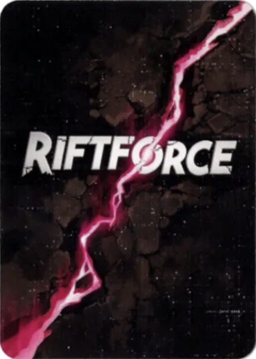
Guys will see this and just think “Hell yeah”.
#75: Dragon Ball Z
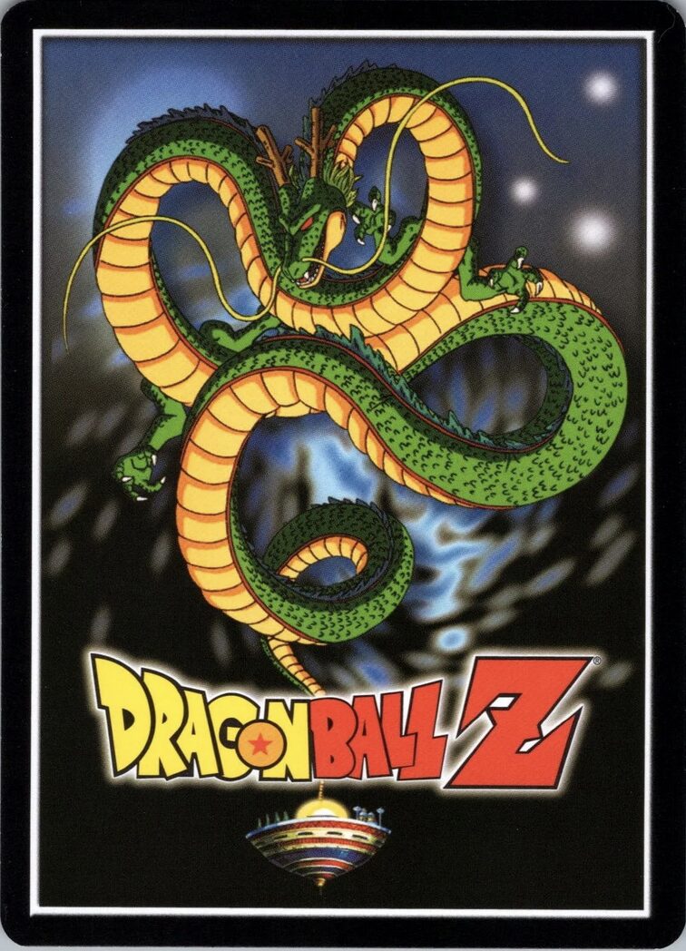
Sure, it’s a little cartoon-pilled and branded playing cards-core, but look at how that dragon fills the space in a visually dynamic way! Does anyone know what Dragon Ball is about by the way? I literally have no idea.
#74: Rise
Nope. This is as high as you go.
#73: War of the Ring
More effort was put into these than Peter Jackson put into the entire Hobbit trilogy. They also hold the dubious honor of being matte, whereas all the other backs on this list went with the safe choice of looking good.
#72: Digimon
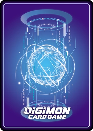
Not very provocative, but pretty to look at, and it somehow avoids being bottom-heavy. Don’t go repeating that to your friends now.
#71: Exodus
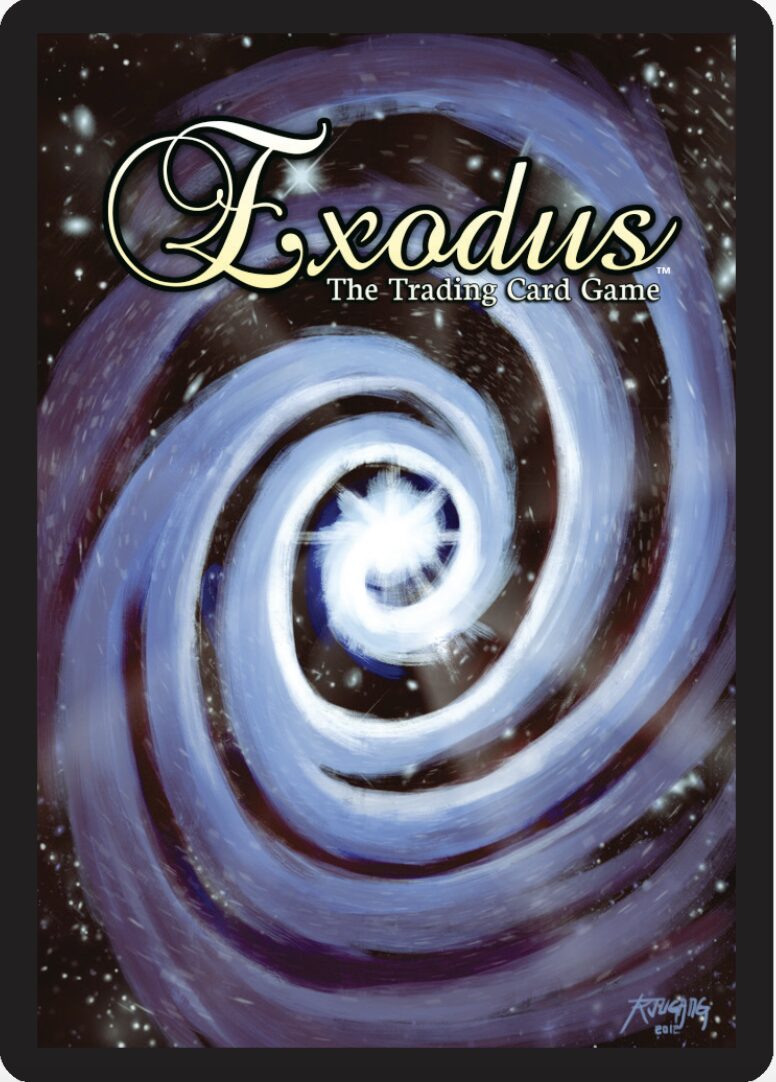
We are 71 entries deep into this list, so it’s time for the veil of journalistic professionalism to start showing its cracks. There are times when I sit down to start writing an entry on this list, look at a card back I’ve already ranked low in my head, and, like the light of God burning away Sodom and Gomorrah, its heretofore overlooked beauty strikes me so viciously I have no choice but to totally reevaluate my ranking. Exodus was one such case. Something about the gold cursive font and painterly galactic spiral which I found silly and incongruous before suddenly became perfect and whimsical on second glance, like an extroverted cousin to The Swirl.
I would also recommend checking out the game itself, which has extremely vibrant, colorful full-card art that almost puts this back to shame.
#70: Thunder & Lightning
Thunder & Lightening has two extremely unique back designs with a cool art style to boot. I am unfortunately compelled to point out that Vikings historically did not wear horned helmets and Norse gods do not exist.
#69: Lightseekers
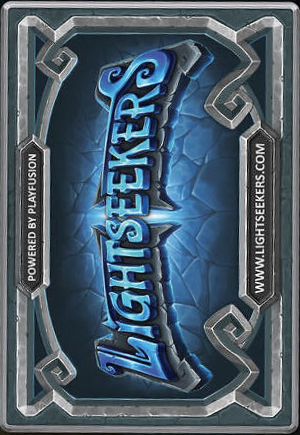
I don’t want to see a horizontal card back ever again. What dark forces compelled the creators to link their website?
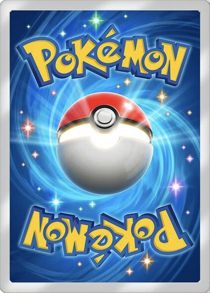
#68: Pokémon
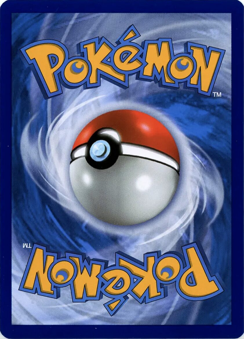
We finally arrive at the first and easily worst of the three patron saints of card backs: The Ball. This design for the Pokémon TCG is undoubtedly memorable, and you know what else? Ugly. That’s right. It’s kind of nasty, no? Cobalt blue and overripe banana yellow are the colors you put on an invented symbol placed on tainted ground, so that despite all unbridgeable cultural differences, future civilizations will see these colors and instinctively know this is not a place of honor.
That’s not to say there’s nothing of value here. The symmetrical cloudy swirl provides a nice sense of movement and impact, even if it looks muddled on the blue background. And the Poké Ball is an iconic and visually splendid centerpiece. Some may point out its anomalous design (the button should be on top), but I’m not one to go around overanalyzing minuscule design details, and there’s no published, numbered list you could point to to prove otherwise.
#67: Cardfight!! Vanguard
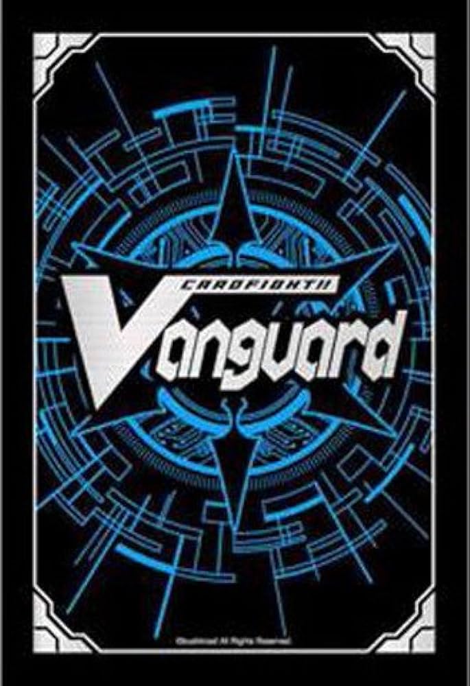
Does a game called Cardfight!! Vanguard with that number of exclamation points really have a better back than the second most popular TCG in the world? Possibly. I’ll admit, it doesn’t look good for my credibility. I like the white on black border though.
#66: Sorcery: Contested Realm
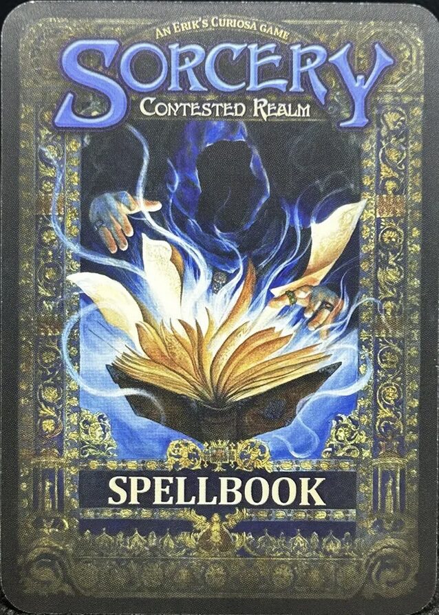
Perhaps a controversial placement, Sorcery: Contested Realm has a highly-detailed, fantastical design, but it’s a little too busy and its colors a little too dull to fully work as a card back. That said, I would probably rate it higher if it didn’t mean having to rearrange this list for the 100th time.
#65: Dice Throne
It took me an embarrassing amount of time to realize that was a die.
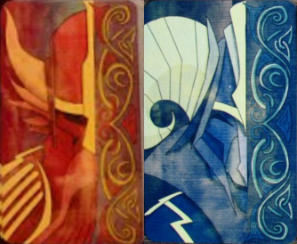
#64: Android: Netrunner
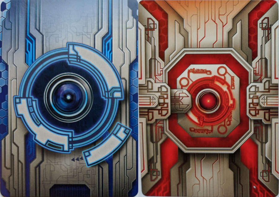
The deep red and blue colors and overeager linework make Android: Netrunner’s original backs nostalgic to some, but I would like to draw your attention to the Corp (red) card. What a creature; it only gets better the longer you stare at it. It’s like the early 3D movies that were contractually obligated to include shots of things flying toward the camera to justify the gimmick. Good god, the sides aren’t even symmetrical. How good is your depth perception? How many layers of techno-nonsense can you spot? I count eight, but it may have grown more since I checked.
#63: Runeslingers: The Awakening
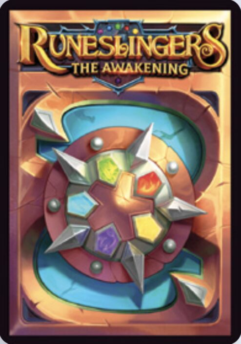
Did I mention I love the card back design philosophy of Central Thing surrounded by five or six Colorful Things? It’s fun. It’s pretty. It summons Magic players faster than an overpriced crossover with a piece of media that shares no thematic or visual similarities to the base game. And here it is in action with Runeslingers: The Awakening. Why is the Central Thing canted 15 degrees to the right? That’s between Runeslingers and God.
#62: MetaX
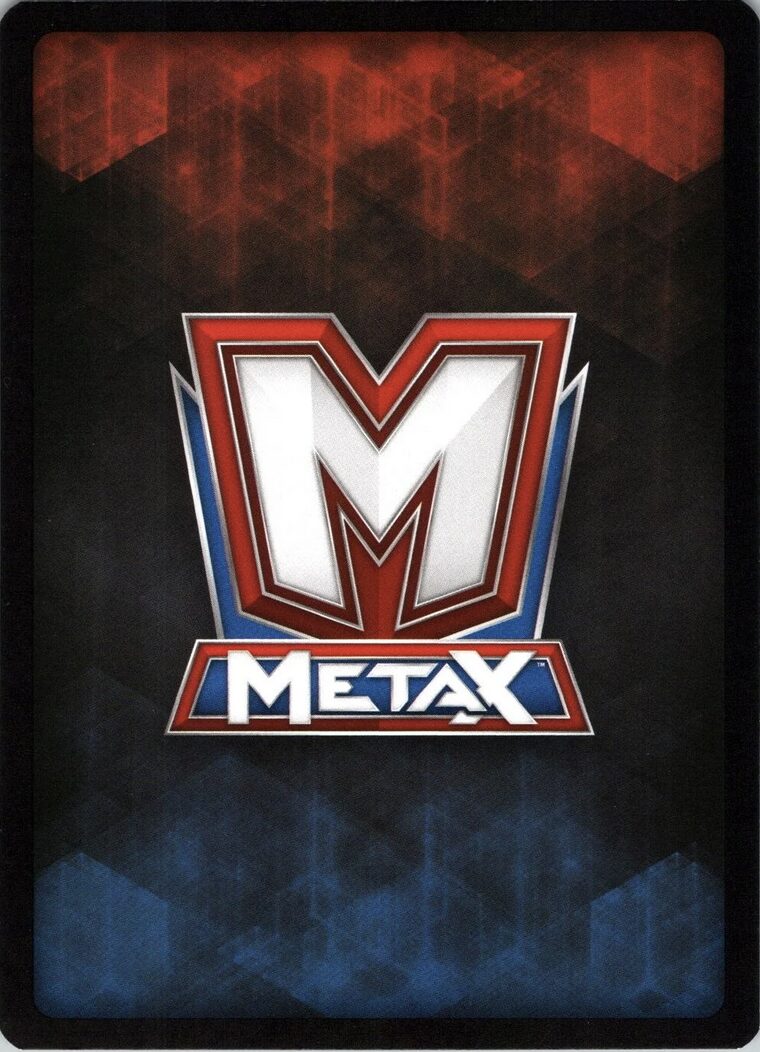
Something about this screams “presidential debate” and I don’t like it. Shoutout to my two least favorite social media platforms though.
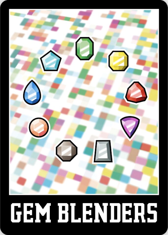
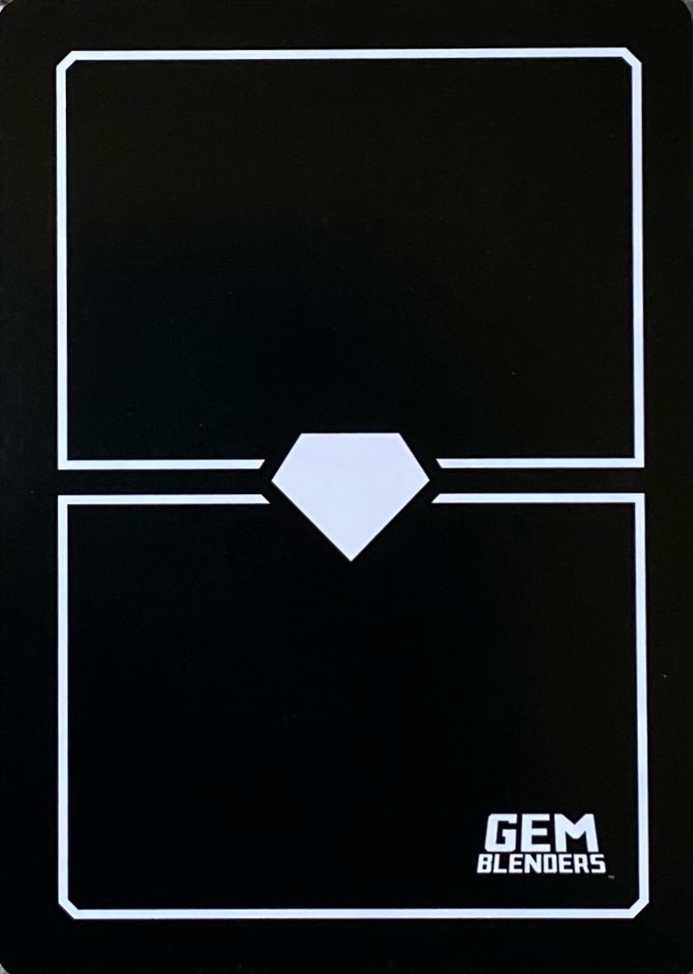
#61: Gem Blenders (Back #1)
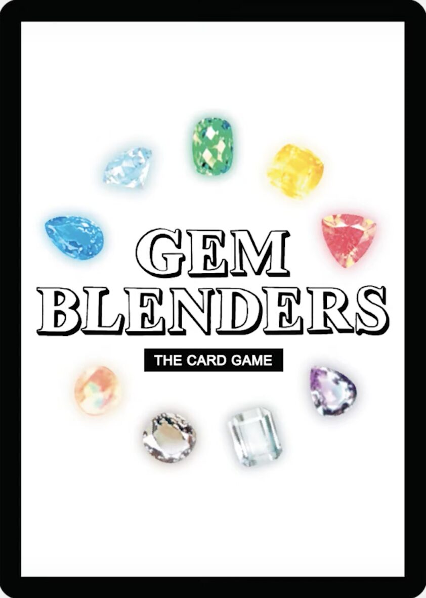
Full disclosure: I have met and played with the Gem Blenders team several times and not once did they let me win with my mediocre life burn deck in exchange for a higher ranking on this list, so that alone should prove the strength of their character, if not their capacity for mercy. Even without quid pro quo, the original prototype card back for Gem Blenders manages to hold its own this high on the list, despite the awkwardly realistic placeholder art for gems and a logo that looks a little too much like WordArt, the likes of which I used for every paper written circa 2010. Such is the power of the Central Thing surrounded by five or six (or nine) Colorful Things, though it also helps if your TCG is the author’s latest obsession. Cannon Boomer support when?
#60: Mage Wars
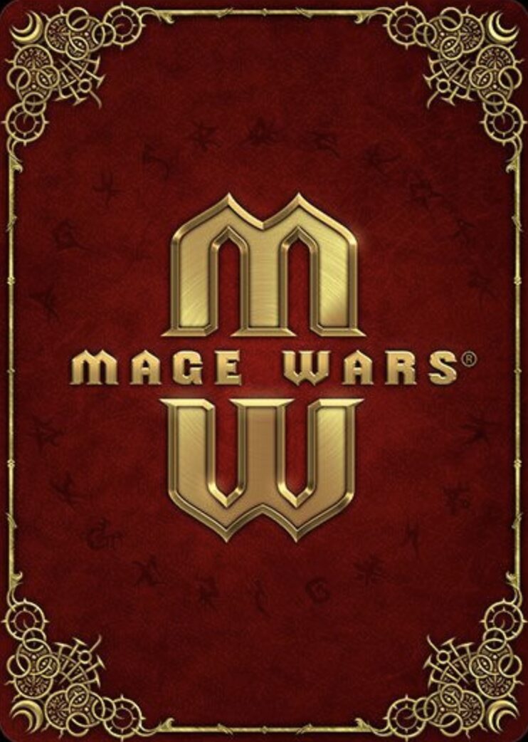
Red and gold is a unique color combo, and look at that! The mirrored M turns into a W to stand for Mage Wars. Do you think they came up with that first and then made the entire rest of the game after?
#59: Sorcerer
I don’t know what this thing is but I would very much like to covet it.
#58: Varia
This is a Checkpoint. If you’ve made it this far into the list without skimming, you’re stronger than most, and you deserve to have your dedication acknowledged. This card back for some game called Varia? It doesn’t matter. It’s nothing compared to what you’ve achieved in ad revenue for Hard Drive at this point. For your reward, you should write something smirky and knowing in the comments— something only people who read this entry will recognize. That way the commenters who only skimmed through and the bot that won’t shut up about its salary will be confused, but you, me, and your fellow peers? We’ll know.
I’m thinking “pencil”.
#57: Force of Will
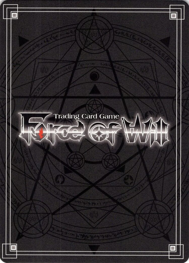
There’s a little too much stuff in the background, and I’m not a fan of the way the title crowds up so close to the edge, but the white double-lined border gives this back a dramatic appearance, and the flourish of the interlinked boxes in the corners is a nice touch. More backgrounds should use this kind of faint, muted linework— albeit not to the extent that it becomes an engagement-bait puzzle on Facebook in the vein of “How Many Triangles Do You See?”
#56: Worldbreakers: Advent of the Khanate
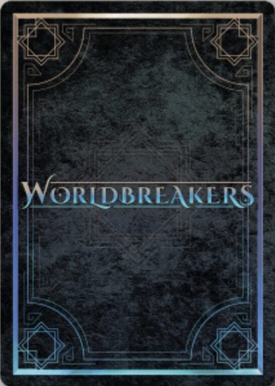
Worldbreakers has a very similar card back to Force of Will, but sports a colorful gradient in exchange for a worse title. It kind of gives the effect that the card’s been dipped in oil, trace amounts of which would make it vastly more valuable to the U.S. than it currently stands as a drop in the TCG ocean where all the fish have long since settled down in their reef of choice.
#55: Netrunner
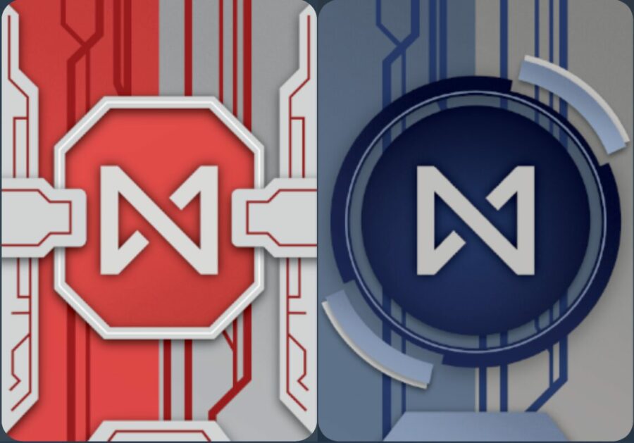
There’s Android: Netrunner and then there’s Netrunner, and only one of them is a dead game. Thanks to a dedicated community of fans and the substantial efforts of Null Signal Games (formerly Project NISEI), Corps can keep scoring agendas and hackers can run another day in this near-perfect cyberpunk TCG by Magic creator Richard Garfield. For what I presume are legal reasons, Netrunner replaces all the art of the original game with impressive homages, and that includes the card backs. The red and blue Corp and Runner backs have been simplified—thank god—and flattened, while still retaining the general layout and recognizable shapes, such as the circle and floating arcs in the Runner back and the bizarre little bridges characterizing the Corp back. In my opinion, they flattened both the layers and the colors of the originals a little too much, losing some of the depth and contrast, but I’ll happily play with these cards if it means Netrunner continues to thrive, and Runners can keep jacking ass-first into my Urtica Cipher for a f:)ck you amount of net damage.
#54: Exceed Fighting System
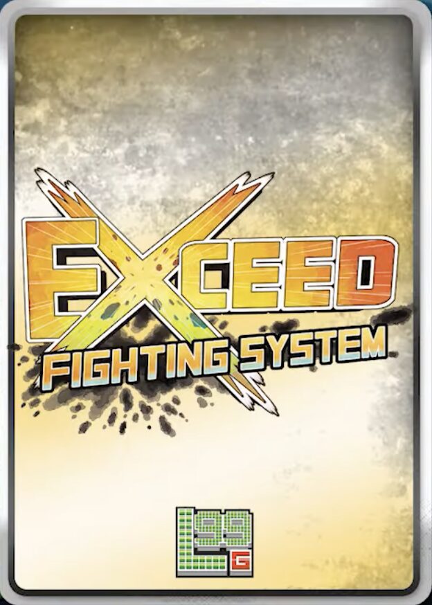
This back is just a logo, but it’s a cool one, with some welcomingly uncommon colors, off-kilter text, and the X splashing across the card. It needs more though, which is something that can’t be said about this list as a whole.
#53: Gem Blenders (Back #2)
The second back for Gem Blenders is a huge step up from the first, and you can tell more care was put into it than my sad flirtation with a “Duc Beatdown” deck. The placeholder gem art has been swapped out for the real deal, a better font was chosen for the logo, and we even got a fun background that manages to be multicolored in a unique and unexpected way. My only gripe comes from the bottom placement of the logo, which looks extremely unbalanced on a trading card, and makes the design a better fit for a rulebook or poster. If there was a way to incorporate the text back into the center, this design might be perfect, unlike my logic in creating a mill deck for a game where every deck is 50 cards and deck-out isn’t even an instant win condition. Mill support when?
#52: Scattered Nexus
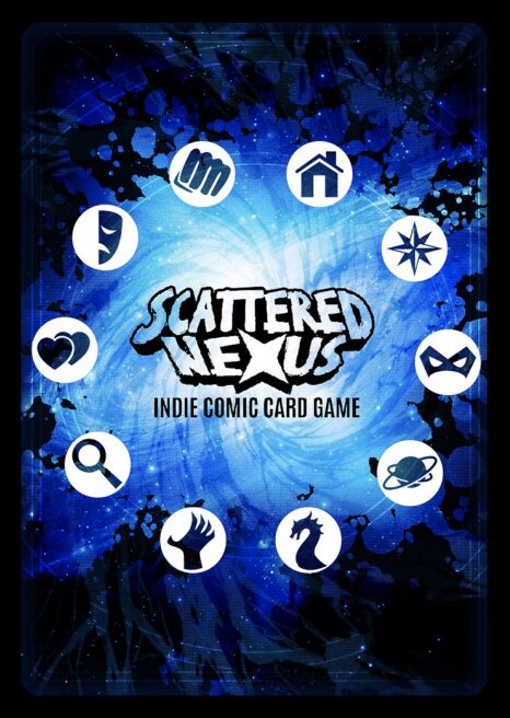
One of the only fun parts about ranking every TCG back on this earth is that you get to sift through a hundred different Magic clones and Magic clone clones and still be pleasantly surprised every now and then. For example, I thought Scattered Nexus was a generic superhero card game with a good back in a classic style, until I did the minimum amount of research to scrape for joke material and learned it was actually a multiverse mash-up combining the worlds of various webcomics from across the indie comic scene, each with their author’s unique art styles and worlds. That’s a rockin’ idea. Is the game any good? Don’t ask me, I’m just judging books by their covers here.
#51: Kryptic
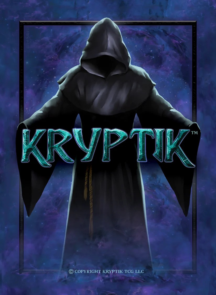
Kryptic used to be so far down on this list, but like the girl in the movie taking off her glasses and letting down her hair, a small change in perspective is sometimes all that’s needed for something to be considered classically beautiful. For Kryptic, that change in perspective was me slapping myself in the face so hard I saw stars and saying “What the hell is wrong with you?? This back goes so hard my eyes are popping out of my skull and my pupils are dilating in time to spell the word ‘AWOOGA’ in Morse code.”
#50: Polywog
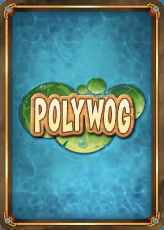
Polywog as a word feels extremely slur-coded by way of Harry Potter. I will not be explaining my thinking at this time.
Unlike Harry Potter however, this back is diverse and refreshing. It’s like staring down into a fish tank, one where all your fish have coalesced Annihilation-style to form the word Polywog.
#49: Age of EON
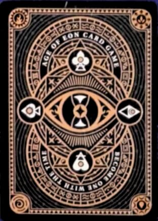
If you spend enough hours researching card backs, it’s only a matter of time before the Google algorithm says “Alright, we get it” and starts feeding you ads for every single TCG launching on Kickstarter within the next year. Consequently, I have seen more sponsored posts in my feed for something called Age of EON than likely any human alive. I can’t even be mad. Not only did I make this bed; I cut down the trees, stained the wood, constructed an elaborate system of interlocking mortise and tenon joints in lieu of nails, and now it is mine to lie in. And what did it get me? A pretty cool card back, admittedly— even if it does feel like Bicycle has enough grounds for a copyright claim.
#48: BattleCON
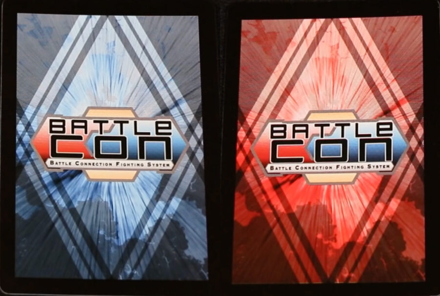
Bold colors and a fun shape! Like a popsicle in that regard. I am easily pleased.
#47: Fights in Tight Spaces
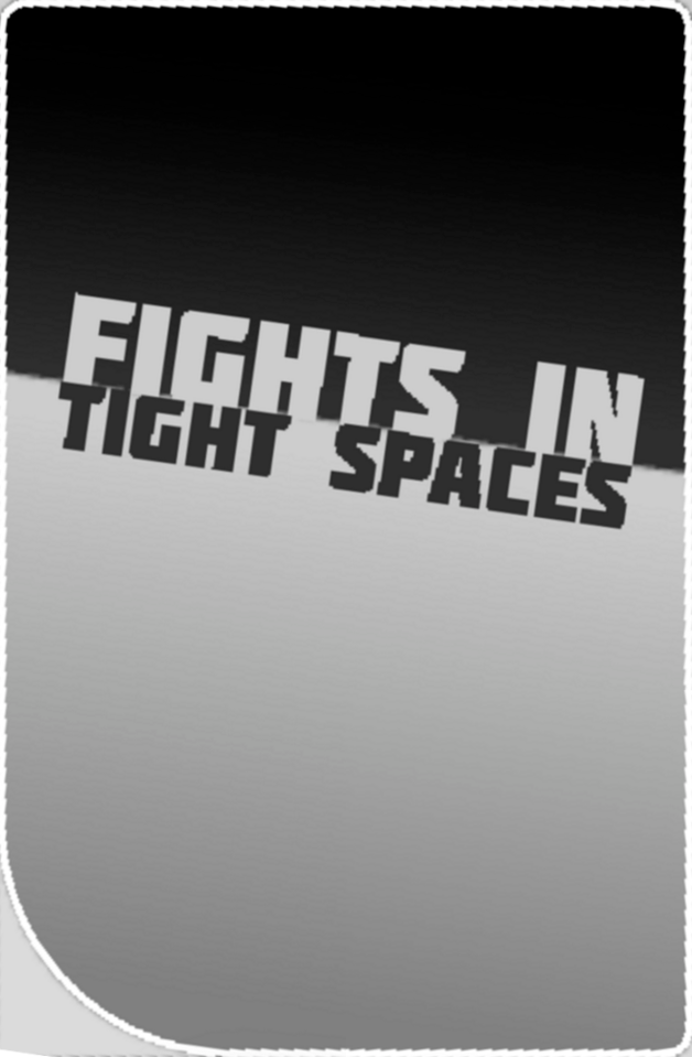
Fights in Tight Spaces is possibly the most underrated deckbuilding game I’ve played alongside Iris and the Giant— the key difference for this list being Fights in Tight Spaces has an actual card back I can rate. I played this game before I’d even heard of Slay the Spire, so when I finally did experience the latter several years later, it was like playing Dark Souls before reading Berserk and then accusing Kentaro Miura of plagiarism.
That is to say, Slay the Spire rips off so much from Fights in Tight Spaces if you ignore the basic fact of their release dates. Cool art, interesting card synergies, one song that plays on loop for almost the entire game, it’s got everything. The card backs you can see in Fights in Tight Spaces exist in tiny piles representing your draw pile and discard, and this back works well at that size and with the game’s monochromatic art style (plus, the single rounded corner is a neat touch). It’s nothing to blow your socks off, sure— unlike Wall Jump Punch, which absolutely carried me through the final boss.
#46: Ashes Reborn: Rise of the Phoenixborn
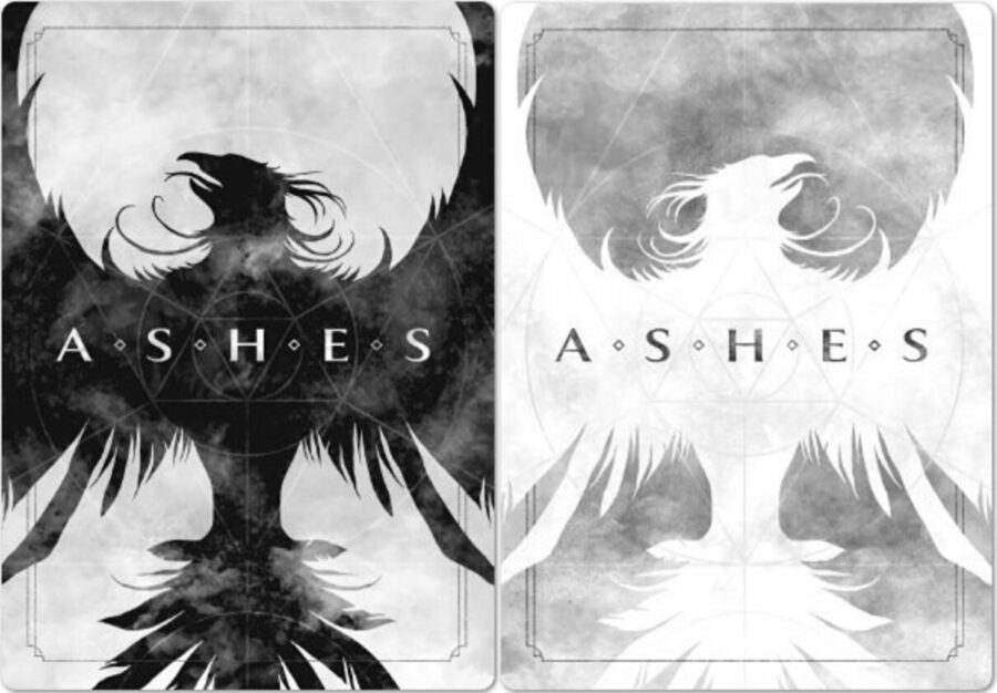
Setting aside the name that sounds like two video game sequels welded together, for whatever reason I feel nothing when I look at these card backs. They’re badass on paper, but something falls apart in practice. Maybe it’s the trite phoenix imagery, or how it looks like box art for a Skyrim clone, or the way the wings seem to thoughtlessly bleed off the edge of the card. Or maybe the name is simply so bad it transcends the corporeal plane and has weeded in the realm of aesthetics, and my dispassion is merely a symptom of a brain weary from the thousand numbing stings of the pricker plants nesting there.
#45: KeyForge
I wouldn’t blame you if you found this card back supremely ugly. Without a doubt, choices were made. Personally, I think it comes together to form a playful, unified whole, and one that feels great when it comes to forming parasocial relationships with your decks. KeyForge’s whole gimmick is that each deck is sealed and unchangeable with a unique combination of cards and factions, plus a randomly generated deck name and emblem. This name is usually half-nonsense like “The Impervious Stomach of Ottumvenue”, but less commonly, the algorithm will—like infinite monkeys on typewriters—dream up perhaps the greatest string of words you could see printed on a card back, of which “The Boy who Basically Headbutts Heaven” and “Dong Ripper the Castle Freak” are two 100% real examples.
In fact, I could spend the rest of this article listing real KeyForge deck names and the average reader would not register any perceived dip in quality. But since that would be my college degree going to waste, I’ll reserve that gag only for encounters with card backs for which I have truly, absolutely nothing to say.
#44: Nostalgix
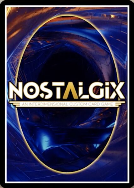
The Pilot that Jabbers at Heteronormativity.
#43: Inscryption (Act I)
Finally, after two decoys, we arrive at Inscryption’s true card back, and unsurprisingly, it’s a good one. Like the game itself, the cards in Act I feel tactile and evocative, with a design alluding to night and day, balance, and untamed wilderness, while faint scratches through the pixel art hint at wear and tear as well as Leshy’s refusal to invest in sleeves, a position I wholeheartedly respect. I can’t think of any way to improve on this back that wouldn’t detract from its homespun charm, or lead to GameFuna OTK-ing my ass in a legal sense and also probably a physical one.
#42: Gem Blenders (Back #3)
The final iteration of the Gem Blenders card back is probably not what anyone expected, but I think it’s a highly competent redesign. Does part of me miss the colorful ring of gems? Yes. Is black and white a little serious for a game where the characters look like chibis and the booster box canonically holds delicious pizza? Maybe. But this design feels elegant and balanced where the previous ones were vibrant and chaotic, a vibe that fits as well with “gems” as the latter does with “blends”. Neither is poorly made or ineffective, something that can’t be said for my Chain Smoker Beatdown deck. Chain Smoker support when?
#41: Slay the Spire (Board Game)
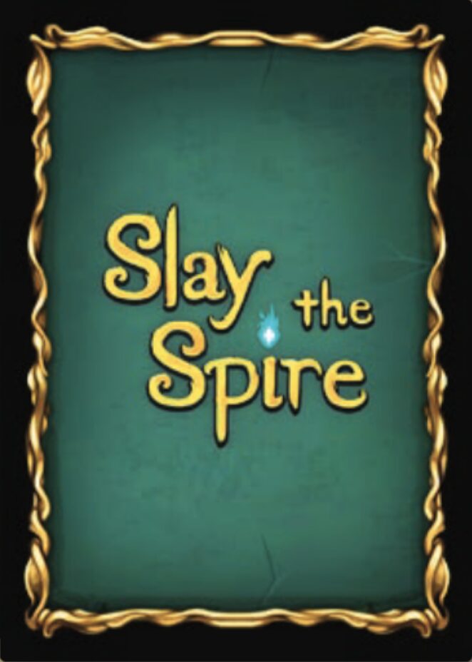
If you loved Slay the Spire but thought “Damn, I wish this cost five times as much”, I have good news. The Slay the Spire board game is here, it rocks, and it has a series of nesting inserts so storage-effective I could kiss them. It also has a brand-new card back for the genre-defining game. Unlike the back barely seen in the original, this design sports a soothing green color, a snazzy gold border, and the Slay the Spire logo, the sight of which should—if you’ve been playing the game correctly—provoke a Pavlovian response from your salvatory glands so intense you’ll be glad the cards come sleeved.
#40: Cyberpunk
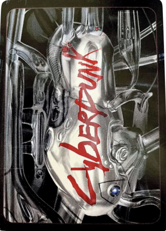
Remember that time Keanu Reeves came onstage at E3, did that thing with his arms, and dramatically said “CYBER PUNK”? If a picture is worth a thousand words, then this card back is the words CYBER PUNK delivered by Keanu Reeves with that same voice and intonation 500 times. And every single time it goes down like syrup.
#39: Bakugan
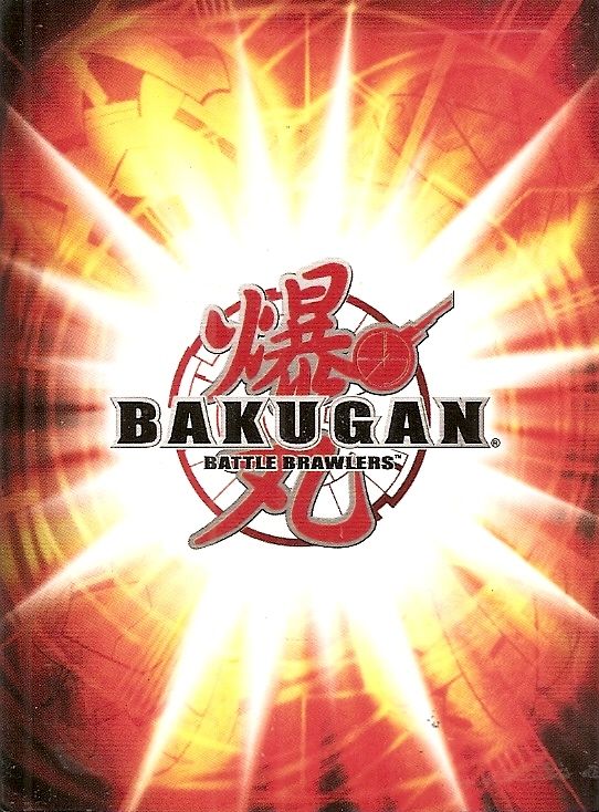
What if a Pokémon card was evil.
#38: Ascension: Deckbuilding Game
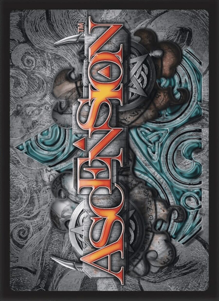
Ascension is the last horizontal card back on this list, and it’s a weird one to go out on. The background is crammed with detail, most of it unrecognizable except as a vague fantasy noise texture, and the glowing red-orange title looks like it’s been slotted in flush with the backdrop with almost no distinction. Even the letters melt into each other. It’s a strange, highly unique look, fun for your eyes to chew on, and maybe your mouth too, if you’re into that.
#37: Future Card Buddyfight
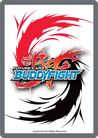
Would be higher if not for that biblically awful gray border.
#36: Ivion
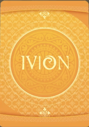
I can’t think of another card back that went all in on any one choice as much as Ivion does with yellow. What do you want me to say? This is the yellow card back. The one that’s yellow. It has some fun patterns and pleasing symmetry. It’s yellow. A little orange. Mostly yellow. The yellow one.
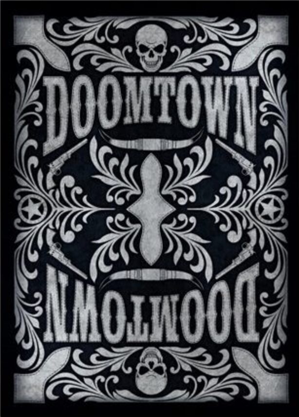
#35: Doomtown: Reloaded
Doomtown: Reloaded is about as rad as a playing card can look, but it still looks like a playing card.
#34: MonStrider
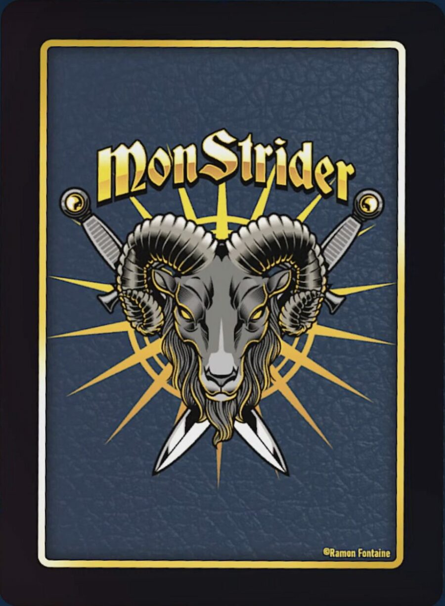
This back looks so, so good. The extra thick border, the gold on blue, the inset leather texture, the font that looks like it makes more money in a week than I make in a year, everything. I have no criticisms, unless me saying a dealer at a blackjack table in Vegas could whip a deck of these out and I wouldn’t bat an eye is a criticism.
#33: Mythrel

Good card backs are a commonality I’ve noticed among modern Kickstarter TCGs, and it’s nice to see this important aspect of trading card design upon which my career apparently depends receive the time and attention it’s due. While I don’t completely understand the functionality of Mythrel’s card back (what are the ropes doing?), I can’t deny it’s a joy to behold. The three-piece construction gives the design a unique visual weight and appearance, and the faded charcoal sketches add much-appreciated thematic flavor. I would gladly hold a hand of these.
#32: Wager of Troupes
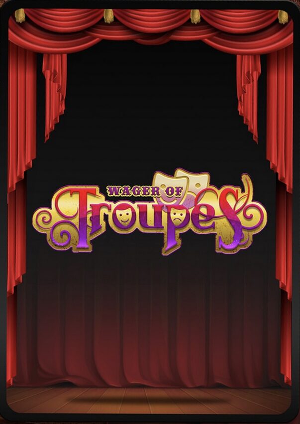
Wager of Troupes is a TCG about rival troupes of supernatural circus performers that is, as far as I can tell, a dead game— or maybe a game that died peacefully in the womb. It has a Kickstarter page that still says “Upcoming”, though I’ve seen no news for a year or two. The game has a completely original theme and aesthetic, which allows for interesting mechanical flavoring (tapping is called “bowing”, artifacts are “props”, equip cards are “costumes”, etc.) and a suite of kooky performers, ranging from pyrotechnic demons to musical automatons and undead puppeteers. The art is splashy and colorful, and the playing field is sectioned out like a real stage, with an “Audience” (members of which act as your resources and win condition) facing a large “stage” where you summon your performers, as well as “offstage” and “backstage” (your discard). This commitment to theme is echoed even in small details, like the way your deck is called your “playbill”, and discarding is called “sabotaging”. Netrunner pulls this stunt too, and it’s these touches that can turn a hobby into an obsession.
Alas, it was not to be. This may well be an epitaph for one more TCG that fell in the forest and didn’t make a sound, but what Wager of Troupes leaves behind should not be overlooked. Least of all this card back, which uses the aesthetics of a stage to paint a captivating back design. I love how the curtains form a border, the eeriness of the shadowed, empty stage serving as the backdrop for the logo. It’s a perfect encapsulation of my feelings: the tension of waiting for a new performer to step onstage and dazzle you. The emptiness when they never arrive.
#31: One Piece
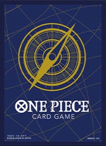
So, is there more significance to the compass than it being an instrument with which one navigates the sea and locates treasure? Because it feels lacking as a symbol to represent the entirety of One Piece on a trading card, especially if that’s all there is. Don’t get me wrong, it looks nice, and I’m not just saying that because I’m deathly afraid of the One Piece fandom breaking into my house and walling me in with hundreds of volumes of manga they’ve claimed to have read à la The Cask of Amontillado.
#30: UniVersus
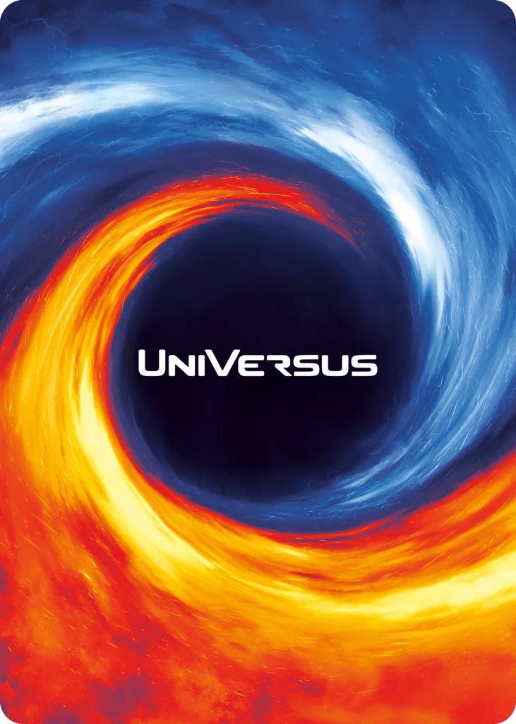
UniVersus has had three different backs since its first publishing, with this one being the most recent. The choice to go borderless for a design like this is interesting, and the double spiral evokes The Swirl in a way my brain finds pleasing, but orange and blue is a color combo that cultured minds will immediately associate with Portal, and few things can successfully bear the weight of that comparison.
#29: Valiant Wars
This gleaming, royal card back comes from Valiant Wars, an incredible press-your-luck deckbuilder that plays like a high-stakes game of Blackjack. You start with a small deck consisting of gold, soldiers, and two Dark Omen cards. Everyone starts by flipping over the top card of their deck simultaneously and repeating this until they either drop out or draw two Dark Omens and bust, amassing money to buy more soldiers and gold to pad out your deck, Swords to win you the round’s Victory Points, and champions with various effects and Sword values. Valiant Wars isn’t a TCG, but it is worth your time— if for no other reason than its lovable art style, which depicts every champion as something between a chibi, a webcomic character, and a twink.
#28: Shadowrun
Vertlet, the Dramatic Bush Infiltrator.
#27: Shadowverse: Evolve
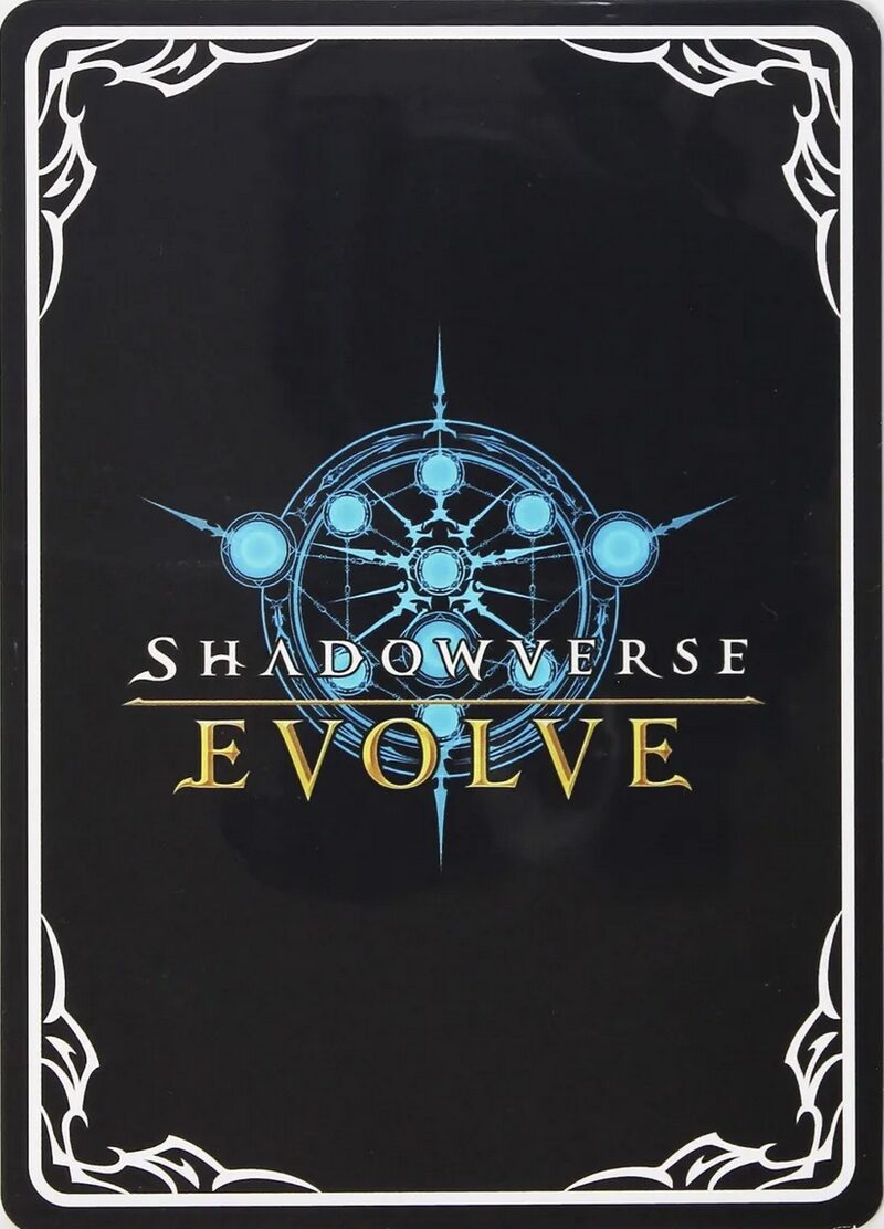
He that Rapidly Contributes to Society.
#26: Hyper Juken
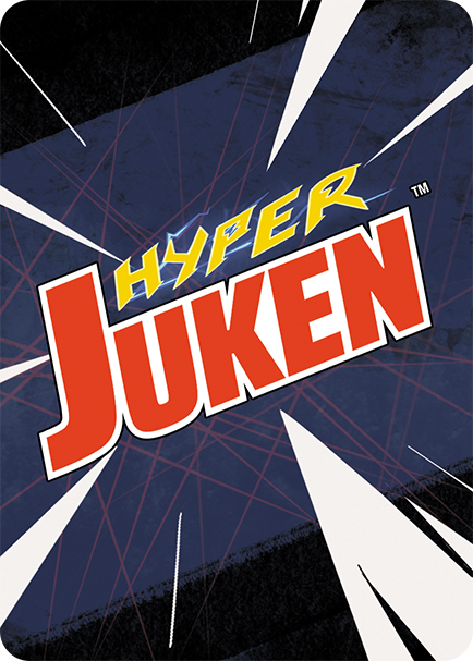
Is Hyper Juken the world’s first furry TCG? Look it up and judge for yourself— all I can say is art where the animals have human proportions makes me nervous. This back has none of that though, and it sings. In fact, I would go so far as to say speed lines have never looked so good.
#25: Digimon Digital Monsters
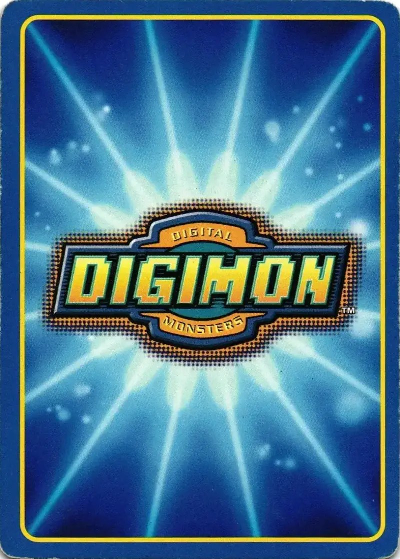
Digimon Digital Monsters puts the Pokémon card back to shame. Here we have almost the exact same color scheme and target demographic, with the difference being this design inspires joy, while staring at the sad, desaturated back of a Pokémon card for any extended period of time will cause symptoms comparable to whatever the opposite of staring at the sun is.
#24: Build Divide
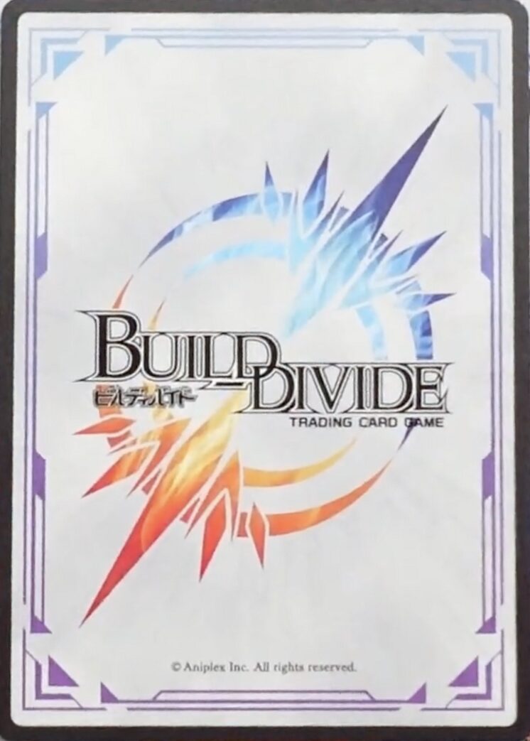
I’m a sucker for white card backs, and the sci-fi styling of the borders and the rainbow oil shimmer on Build Divide’s back is perfect at evoking that bright, clean future aesthetic you see in some anime. The title refers to the practice of players “building” and “dividing” (cutting) each other’s decks before playing a match, or at least that’s what I’ve got for you off the top of my head because I refuse to look into the question further.
#23: My Little Pony
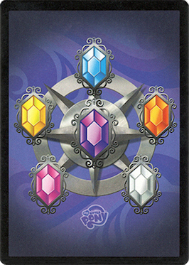
Proof that good design can transcend genres and target demographics. Though transcending target demographics is hardly new territory for My Little Pony.
#22: Dragon Ball Super
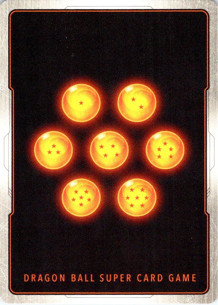
Most people will live their entire lives and never once be half as locked-in as this design.
#21: Mindbug
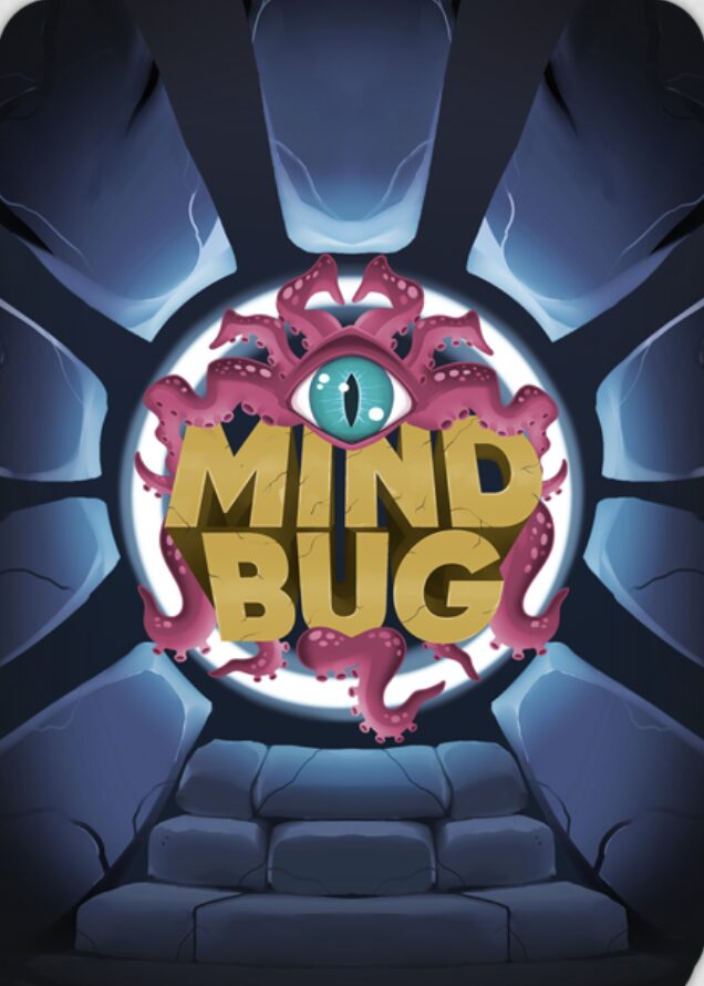
It would be tempting to rag on Magic: The Gathering creator Richard Garfield for being a one-trick pony, or opening Pandora’s Box with the world’s first TCG, or just making what I hope is a crap-ton of money off the backs of cardboard fiends nose-deep in Secret Lairs— if it weren’t for the very endearing fact that this man will not, can not stop making banger card games. He designed Netrunner. He designed KeyForge. He’s designed a new game roughly every two years since Magic. The man is a slave to TCGs, and I have no choice but to respect it.
One such game from 2021 is Mindbug, which has a card back more memorable than any crossover Magic has announced in the last year. The radial design is perfect for drawing your eyes inward, toward the logo, which is nestled small in the center like a tick, or a pupil. The matte textures and cooler tones, plus the muted splash of pink and yellow, makes this card back feel suitably alien and out of place, which is also probably how Richard Garfield feels every time he tries to quit making card games cold turkey.
#20: Titans of Eden
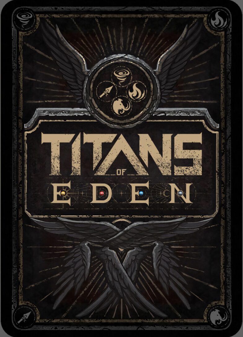
Titans of Eden is a simultaneous deckbuilding game that failed its Kickstarter almost three years ago, and proved what most of us serial backers already knew: Kickstarters are really, really hard, and usually depressing. Yet for all the reasons Titans of Eden failed (technically it was cancelled)—not laying enough groundwork, too few reward tiers, not having generic anime art—you can’t say it didn’t have “the goods”. The online demo, which you can still play on the game’s website, is slick and fun with an incredible amount of polish, which this intricately-crafted card back demonstrates all on its own. The fonts, the layout, the detail, the way it wears shades of black better than every other back on this list. Sure, it’s a touch over-serious, but Titans of Eden deserves better than being lost to time. It doesn’t have to be that way though. Not if the comments section puts on the greatest talent show this town has ever seen.
#19: Magic: The Gathering
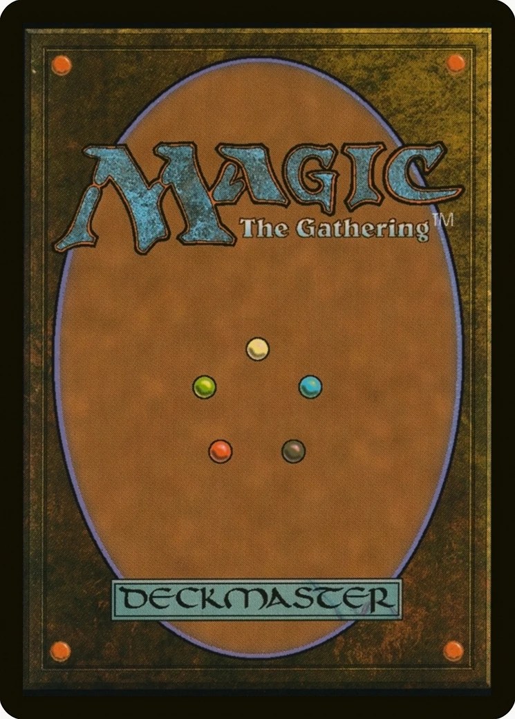
If trading card games have a God—and they do—it is undoubtedly Magic: The Gathering, a game that brought hope and community to millions of players and is currently dying for their sins. It pioneered many things: tapping; keywords; the mana system; milking a player-base for everything they’re worth. What it didn’t pioneer was great card backs. Which brings us to The Brown on Brown, our second patron saint of this list.
The MTG back looks like it was designed with cardboard in mind. The outer color is a muddy, almost sandy brown, while the oval is so close in hue and texture to actual cardboard, you’d be forgiven for going at your opponent’s deck with a boxcutter. Suffice to say, Magic’s card back is probably higher on this list than it should be, but you can’t resist a certain fondness for it. Like a genetic memory pulling at the back of your brain, telling you to untap before you draw or your opponent might be an ass about it, it’s hard not to admire the familiar oval-in-rectangle layout, the precise pinpricks of color representing different mana, the crumbly, perfect font for “Magic”, with “The Gathering” nestled under it like a lover in the crook of your elbow. Even “Deckmaster”, the silly brand Magic was originally going to be under, feels considered and balanced with the whole.
I hate to admit it, but you could do a whole lot worse than The Brown on Brown.
You could be Pokémon.
#18: Gun and Gun
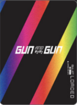
An ECG with a refreshingly obvious name, Gun and Gun has you playing as post-apocalyptic anime girls using various guns to blast each other away. It’s pretty much as cool as it sounds, and that’s before I mention that each of the two guns you choose for your loadout gets its own deck you can draw from and cards you have to “load” into your gun before firing. Rainbow stripes on black don’t particularly convey any of that, but like I said, the title is uniquely self-explanatory.
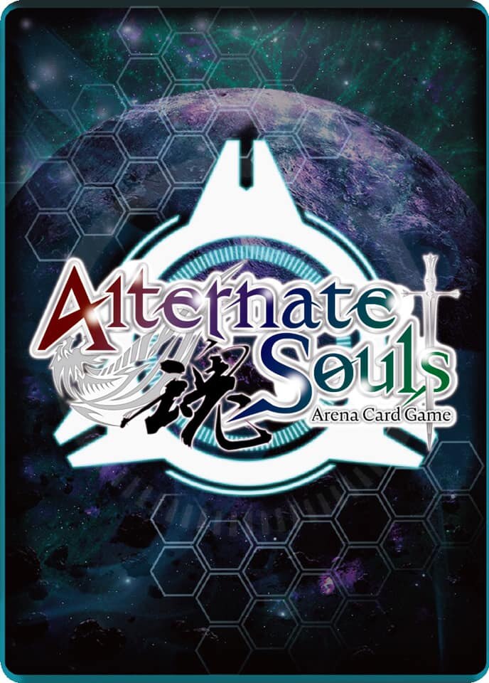
#17: Alternate Souls
Pretty.
Titanflayer, the Farmer of Racism.
#16: Blokes
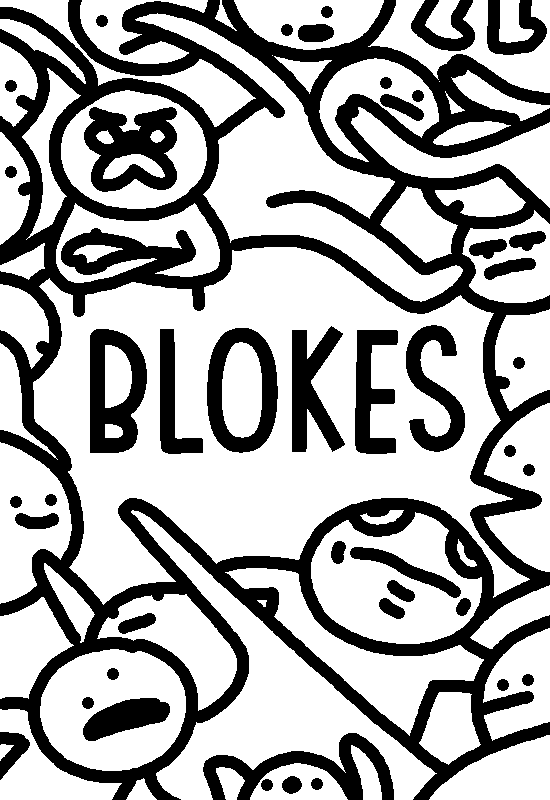
If you haven’t heard of Blokes, that’s because you’re not terminally online and also not in my extremely specific “For You” feed on Twitter, which gifted me this thread by Alec Smith, describing a game he made that may qualify as torture under the Geneva Conventions. On your turn, you roll a die, then add that number to your score. Whoever has the highest score after two minutes wins.
But.
There are Blokes.
You can play a Bloke to gain points and, crucially, add minutes onto the timer. There are many Bloke cards in the game. You may have begun to grasp the problem. Luckily, while you’re playing this game of spite that never ends, you get to look at the wonderful art and appreciate the distinct personalities of each Bloke, like Nate to the Party (who adds six minutes to the timer and has flavor text reading “Ha ha! Sorry I’m Nate!”), Mr. Stop (“Stop right there buddy boy baby boy”), and Idris Elba. The game’s card back, which is positively swimming in Blokes, is perfection— and it needs to be, since it’ll be the last thing you ever see.
#15: Primal
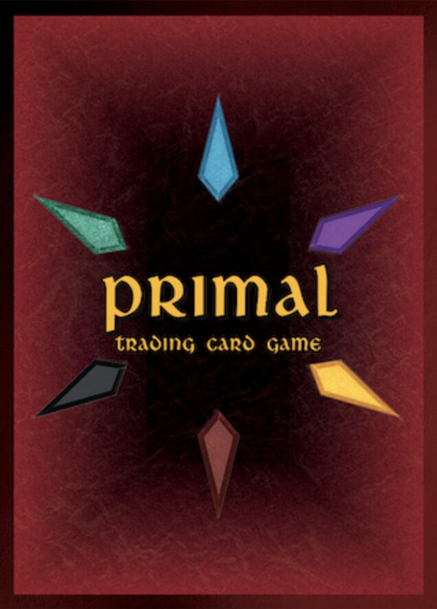
Nothing about this design screams “primal” to me, but it has Central Thing surrounded by five or six Colored Things, so I am helpless to criticize it. And is helplessness not the primal state unto which we are born?
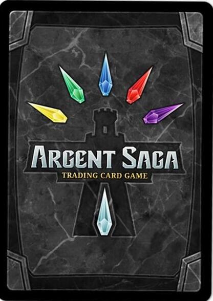
#14: Argent Saga
The Emperor that Pays for Boys.
#13: Sakura Arms
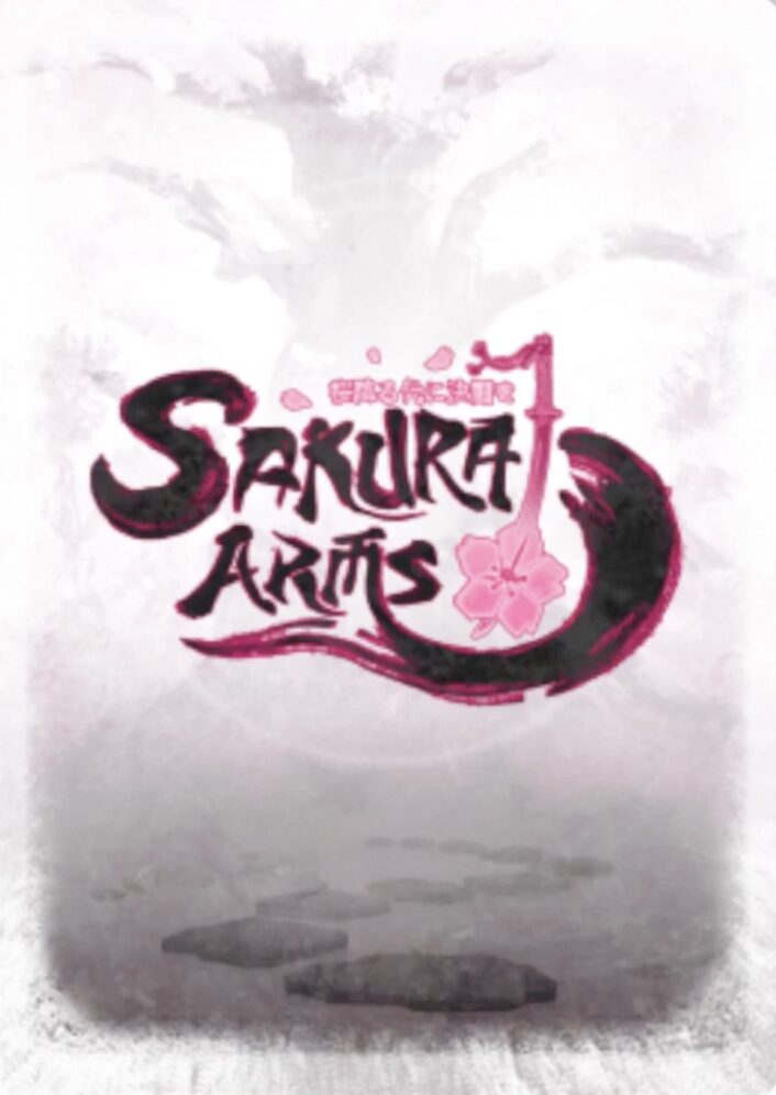
I love the way the gray and white background evokes a canvas teased with watercolors, and the touch of cherry blossom pink in the black ink of the calligraphed title is the perfect pop of color. Yes, Sakura Arms is another TCG about anime girls, but it’s a TCG about anime girls with class.
#12: The Caster Chronicles
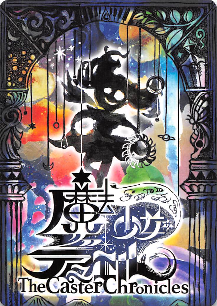
The Caster Chronicles is a TCG about anime girls with no class to speak of, but that counts for crap-all in the face of this deranged MS Paint masterpiece of a card back. It poses several salient questions upon viewing, such as “Am I staring at ten different card backs at once?” and “Is the artist still at large to this day?” I like to imagine each individual piece is thought out, each colorful blob and asymmetrical drawing considered, but to be honest the opposite would please me no less. Make no mistake, there is a coherent vibe here. The dangling planets and stars; the encroaching border; the smiling, haunted shade of a girl. The vibe is danger: cosmic danger, or cosmic madness. Potent themes that The Caster Chronicles, a magical girls TCG that stopped releasing sets in 2019, is surely primed to explore.
#11: Altered
Altered is the most recent in a long line of games to smash the record for the most funded TCG on Kickstarter, a record that is broken so often (and by several other games on this list) that it ceases to have meaning. What separates Altered from the competition besides this gorgeously layered card back—which is like a gentle dream shared between a tree and a whirlpool—would be its rancid fixation on placing large QR codes in the corner of every card, in case you needed a reminder that your cards are products of an inscrutable system and not extensions of your imagination.
#10: RYFT Card Battle
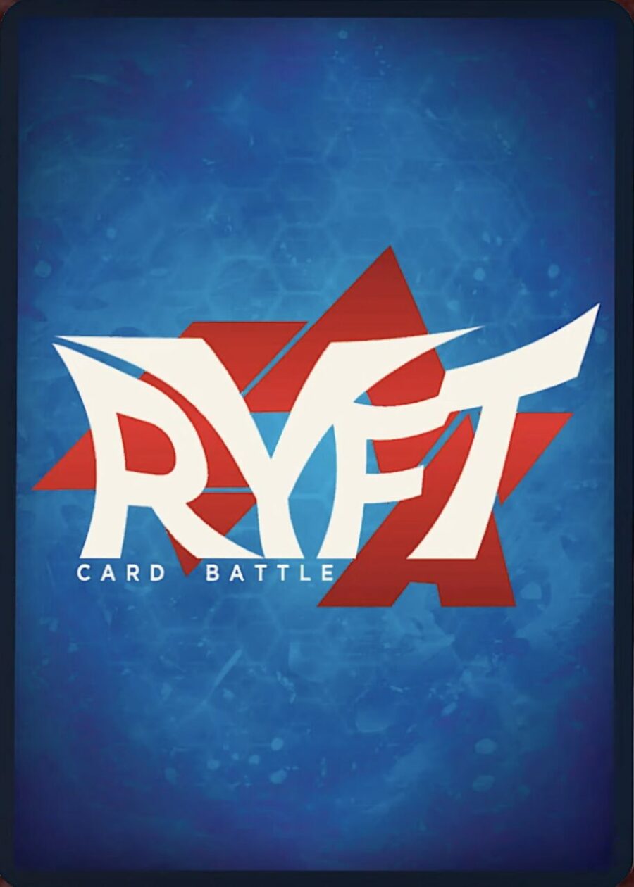
Staring at this back feels like a cool day at the beach.
#9: Grand Archive
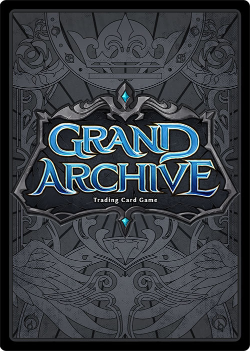
Grand Archives isn’t doing much with its card back, but in terms of a clean design and minimal but effective color choices, there’s not much I’d put over this. The game’s website even touts it as “the first anime TCG that focuses on card clarity” and “clean design”, which sounds like a massive hyperbole except for the fact that I’ve yet to see any evidence at all to the contrary.
#8: Radlands
Card backs that don’t put the title anywhere on the card have a certain swagger to them. The same goes for backs that don’t even try to look like card backs. Radlands does both. Not only that, it dares to have art as good as this on every single one of its cards, which is a feat I cannot say is true for all or even most of the games on this list. The way the design makes a white border out of negative space is novel, but who gives a crap about borders when the most badass man alive is staring at you in blue-limned silhouette over a neon pink backdrop? And the white spotlights of those goggles, staring both at and through you? Damn, I need to play this game.
#7: Pokémon Pocket
Be careful who you call ugly in middle school.
My jaw went slack when I saw this glow-up in the Pokémon Pocket announcement trailer. You mean to tell me they were capable of a card back this bright and whimsical the whole time? Was she beautiful all along and I just didn’t see it? It goes to show how small changes build upon a whole. The blue and yellow have been tweaked brighter so they’re fun and eye-catching instead of dirty; the white swirl no longer looks like air pollution; the Poké Ball has stopped cheating the audience, and the dark blue border has been traded out for an equally bizarre yet functional gray one. It’s a beautiful reminder that change is possible if you throw a billion dollars at it.
#6: Bicycle Playing Cards
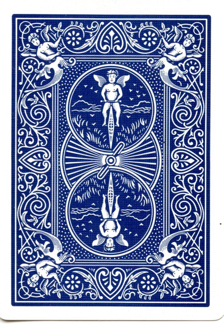
Bicycle was here before all of us, and it’ll be here when we’re gone. When the sun expands beyond Earth’s orbit and welcomes the planet into its embrace; when the last practiced religion is entropy and the only god is Fire, the memory of a billion warming bones will sigh and fondly trace the delicate looping vines and winged cherubs of the Rider Back design into great plumes of dust sipped by the Red Giant sun— an ode to the first, perfect card back (available in strawberry red and blue raspberry).
#5: Alpha Clash
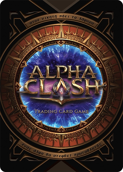
Like any superhero franchise three reshoots deep into a sequel that needs to make all the hype, money, and contract killings worth it, the Alpha Clash back has a little too much going on, but the spectacle is undeniable. Alpha Clash is a relatively new game set in a fresh world of superheroes, villains, and the jaded faces in-between, and it has some of my favorite card art of any TCG that didn’t contract Generic Dark Fantasy Syndrome from the outset. This back design, which looks like the splashy title card of a blockbuster movie, sets your expectations perfectly: get ready for something big, flashy, and possibly dead in a week.
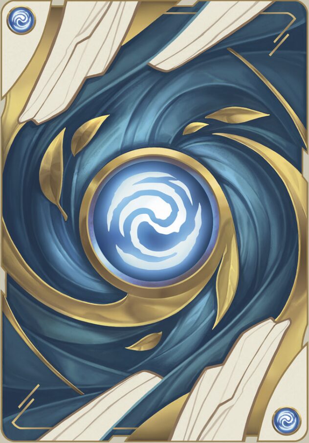
#4: Yu-Gi-Oh
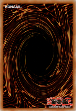
Magic: The Gathering may have been the first trading card game, but any Slifer Slacker knows it takes two to duel. Yu-Gi-Oh might not have the same sales, popularity, or uncomplicated history of crediting artists that Magic and Pokémon do, but there’s at least one category where it excels: the back you stare at waiting for your opponent to finish their board as you count their summons out loud while ogling a hand of brick. Lots of card backs swirl, but none do it as tastefully and mysteriously as Yu-Gi-Oh, whose cinnamon whirlpool steers your eyes into an abyss as black and deep as your regrets. It’s an iconic creation of Kazuki Takahashi, and of the three patron saints of card backs, The Swirl is the only one you’ll ever see in children’s drawings, because it’s the only design simple enough to be imitated and is classically recognizable just from its broad strokes.
I would know. Yu-Gi-Oh was everything to me growing up. It was the blood in my veins, the air in my lungs, and the cancer slowly metastasizing throughout my veins and lungs. If Yu-Gi-Oh one day kills me, it will simply feel like coming home. Until then, whether it’s playing, trading, or tucking my holofoil Masked Chopper in for the long sleep in storage, there are few other backs I’d rather see.
#3: Flesh and Blood
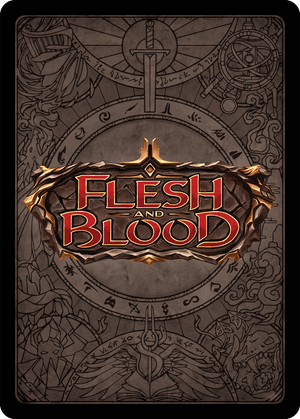
Flesh and Blood leads our top three countdown for the best picture printed on the backside of a piece of cardboard, and of all the TCGs on this list, it’s probably the game I came closest to trying based purely on card back and vibes alone. Unfortunately, what would have likely been a pro career was thwarted by my brief tryst with the rulebook and the fact that most of the cards are actions, and I can’t form tenuous emotional attachments to “actions” in the same way I can to Rescue Rabbit. And that’s a shame, because everything in Flesh and Blood looks so good, from the card layout to the art to, of course, this back, which depicts a beautifully detailed pictographic map of the game world’s eight regions, with the crimson-gold Flesh and Blood logo stamped over top like a wax seal or a sliver of wound. You can actually read the blog post about the back’s creation here, as long as you get a hall pass and remember to take a buddy.
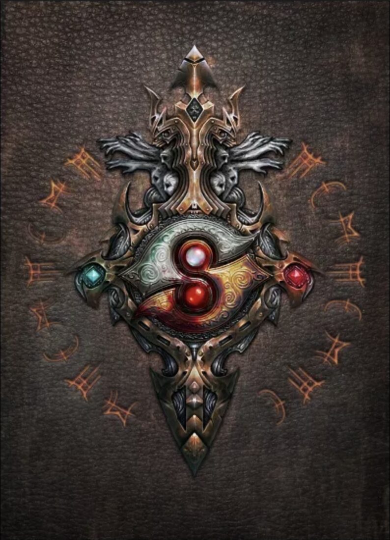
#2: Heresy: Kingdom Come
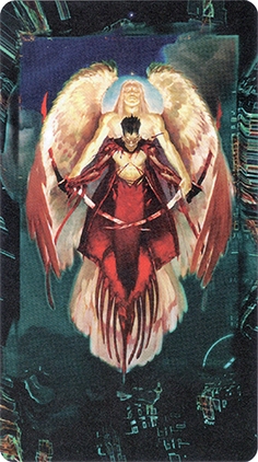
If you were to inject the premise of out-of-print CCG Heresy: Kingdom Come directly into your veins, your bloodstream would immediately carbonate, your eyes would turn nitrous blue, and your skin would erupt into inflamed lesions shaped like the Cool S. That is to say, I can’t think of any card game that goes as hard as Heresy, and I’ve played Netrunner with the best. Releasing just two years after Magic: The Gathering cornered the market on generically palatable dark fantasy, Heresy: Kingdom Come came out swinging with cyberpunk angels and demons. To quote the Wikipedia page straight: “The theme of Heresy [is] the continuation of the War in Heaven between angels and demons in a futuristic cyberpunk setting. The premise is that the barriers (known in the game as the Mirror, Shroud, or Veil) between the physical realm (the Wilds), the digital realm (the Matrix), and the spiritual realm (Heaven) have grown thin, and fallen angels on Earth are trying to use the Matrix (cyberspace) to open a portal to ascend back into Heaven.”
If reading that premise doesn’t make you weak in the knees, Heresy’s edgy, cleverly tarot-sized card back will. The juxtaposition of Heaven and Hell, holy and fallen, are presented in that style of oversaturated religious fantasy you see in old paintings as well as that church you went to one time with the deeply traumatizing sculpture of Christ covered in way too much blood. What looks like circuitry bleeds in from the edges: ever-shrinking, infinitely optimized technology, the blind tendrils of human invention feeling their way through a labyrinth of atoms of God’s making, subverting, repurposing, rehousing the divine in its own house, until the shoots of Old Religion break ground in new, unnatural places. Heresy’s card back tells a story worthy of the number one spot on this list, and it would have it, were it not for an older, even greater God…
#1: Disney Lorcana
Unfortunately for everyone, Disney put the GDP of an entire country into designing the ultimate brand vehicle of a trading card game, and the end result reflects that bottomless wealth. Disney Lorcana not only looks gorgeous, but it has what I’d begrudgingly say is the best, classiest card back of them all.
Surprisingly, there’s little about this design that screams Disney: no overt branding, no Disney colors, no castles or cartoon mice beating back against the ceaseless currents of public domain. It goes to show that Disney can, when necessary, let artists cook— which is when we, loyal consumers with “Brand Loyalty” written across our foreheads in blood, get to feast. Perhaps the most understated part of the design is the way the borders gracefully open up in little notches corresponding to the four points of the central symbol; how the multicolored light trails glow against the black like it’s ink; the way the logo is boosted a few centimeters upward to give it a stately presence while subtly demonstrating the correct orientation of the card.
Lorcana’s card back is beautiful in a way Disney often struggles to be nowadays. Its design isn’t loudly nostalgic or overly precious. Its beauty is more ponderous, like that of the night sky, or the dark waters of a wishing well at work. Many of the card backs on this list have designs that are singularly beautiful but that fall apart when lined up on your opponent’s field like Warhol’s Campbell’s Soup Cans. On the other hand, while I’ve never played Lorcana and cannot understate how much I do not have the time, money, or willpower to engage with another trading card game, I know it would look and feel good to hold a hand of these cards. You could close your eyes, and for a few gracious seconds imagine you’re holding Mr. Disney’s precious millions in between your fingertips. In that moment, your soul would fly up through the wilted drop ceiling of your local game store, into the heavens where Richard Garfield and his fathered legions of bleating TCGs will never reach, and there, for the first time in a long, long time, you can finally stop thinking about card backs.


 This one requires some thinking ahead. We recommend only playing Free Online Poker if you know at least a day ahead of time that you will have a substitute, since you’ll need to steal your Dad’s credit card. Once you’re set up, however, just tell the sub that you’re “studying probability.” They’ll nod in appreciation and wander back to their desk.
 Technically, Runescape is old enough to count as a history project in some curriculums, but even if it doesn’t, you should have no trouble passing this game off as educational. Turn down the graphics settings, and Runescape looks identical to any history game you’d play on IXL or ABCmouse or whatever weird program your school uses.
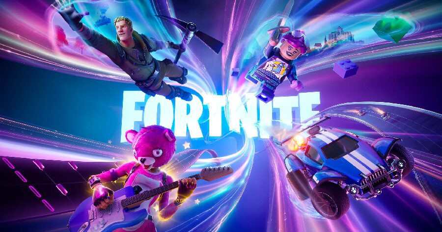 If you want to play Fortnite on your school computer, you’re going to need to bribe the tech guy early in the school year. A couple of Starbucks gift cards should do the trick. Next, you’ll need to purchase and equip the Peabody skin. Once you’ve done these things, all you have to do is tell the substitute you’re playing a “nutrition game.” Never mind that nobody plays games about nutrition anymore. They did when that sub was in school. Ask your parents about Chex Quest sometime.