With the release of Final Fantasy XIV Patch 6.3, there has been a brand new UI theme added to the game! This UI theme is modeled after the ones found in Final Fantasy 7 Remake, Stranger of Paradise: Final Fantasy Origin, and Crisis Core: Final Fantasy 7 Reunion. Here’s how to change the Final Fantasy XIV user interface to this new theme, or any new theme.
Final Fantasy XIV: How to Change the UI in FF14

In addition to the Clear Blue theme, there are multiple other options to choose from. We’ll walk through just how exactly you can change your FFXIV UI Theme to whatever you’d like!
- Select System.
- In the System menu, select System Configuration. This is the sixth option in the list, right under Character Configuration.
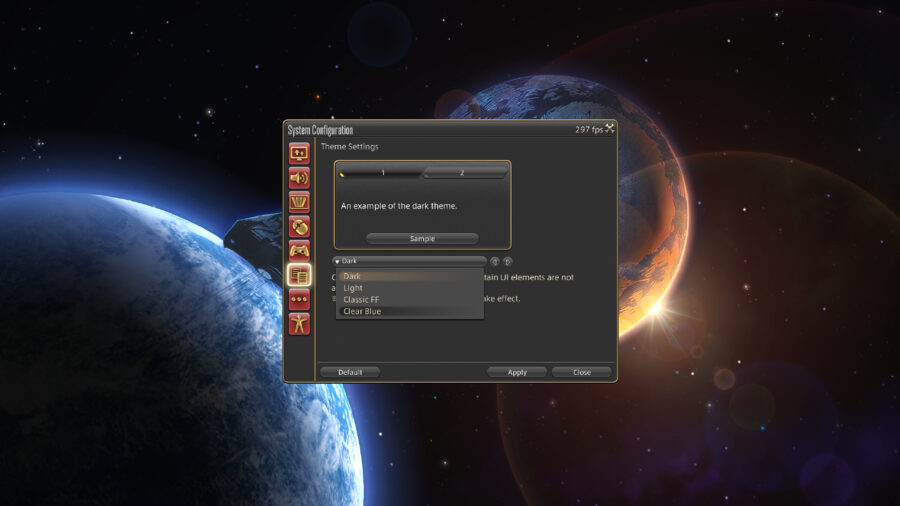
- In this menu, you will see a select group of icons on the left hand side. You will want to click the one that looks like two pages of text, which is third from the bottom. This button will take you to the Theme Settings.
- At this menu, you will need to select the drop-down menu and select the UI Theme you’d like.
- After selecting the option you’d like, you will select Apply. In order for these changes to take place, you will need to completely log out and log back in. A simple restart of the game should be effective.
As for what the Clear Blue theme changes, there are quite a bit of differences. The most obvious difference from the other themes is the blue menus reflecting the ones found in the recent Final Fantasy games. The boxes throughout the game are now rectangular without rounded corners, with standard white text replacing all text. Additionally, all command descriptions also have brand new fonts and colored backgrounds. This is a very nice theme that is something worth looking into if you’ve been rocking the Dark theme for a good long while.
If you’re not quite feeling the Clear Blue theme, there are other Final Fantasy XIV user interface options to choose from as well! First, there is a Light theme that turns all of your menus a tan color, with text turning brown. For those looking for neutral-colored menus, the Light theme will do the trick! Additionally, the Dark theme is incredibly popular for most users. Just like the Light theme, the Dark theme is a very neutral theme, while this time the primary color being a dark gray.
The last UI theme available is Classic, which looks just like the UI of the older Final Fantasy games. The icons become pixelated, which is a nice touch to customize your game to your liking. You can’t go wrong with any of these themes but do make sure to choose the one that you like the most. This change is reflected in all menus throughout the game regardless of what area you are in, so do keep that in mind!


